Please select the platform to login


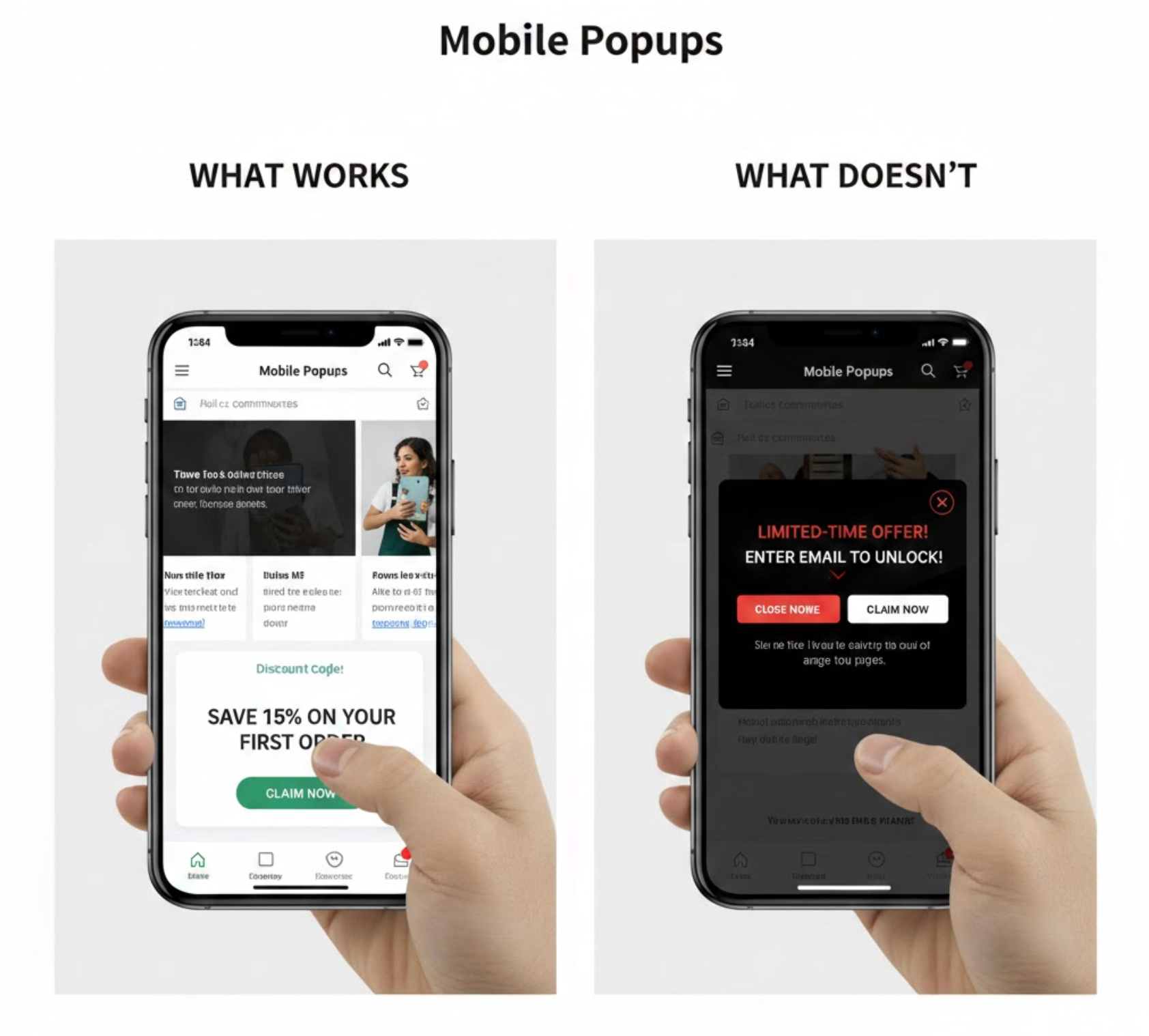
Mobile devices now account for the majority of ecommerce traffic, but they also present one of the biggest conversion challenges. Smaller screens, touch-based navigation, and fast-paced browsing habits mean users are far less tolerant of interruptions. As a result, mobile popups can either become a powerful conversion tool or a major source of friction.
To strike the right balance, businesses must understand not only which mobile popup strategies work, but also which ones actively harm the user experience. In this guide, we’ll explore how mobile popups differ from desktop versions, what approaches consistently deliver results, and what mistakes should be avoided to protect mobile conversion rates.
Unlike desktop popups, mobile popups operate in a much more constrained environment. Limited screen space leaves little room for error, and even a small disruption can feel overwhelming on a mobile device. Because users interact through taps and swipes rather than cursors, mobile popups must feel intuitive and easy to dismiss.
In addition, mobile users often browse in short sessions while multitasking or moving between apps. This means popups must deliver value quickly and clearly. Simply resizing a desktop popup for mobile ignores these behavioral differences and often leads to poor performance. With that in mind, let’s take a closer look at what actually works on mobile.
Popup timing is one of the most important factors in mobile popup success. Instead of appearing immediately, effective mobile popups wait until users have demonstrated interest through scrolling, reading, or interacting with the page. This allows the popup to feel relevant rather than disruptive.
When popups are triggered based on user behavior, they align more naturally with intent and are far more likely to be engaged with. To achieve this balance, the following timing approaches tend to perform best:
By applying these triggers thoughtfully, popups integrate smoothly into the mobile browsing flow instead of interrupting it.
Bottom bars and slide-in popups are particularly effective on mobile because they maintain content visibility while still presenting an offer. Rather than forcing users to stop browsing, these formats allow interaction to continue uninterrupted.
Because they feel like a natural extension of the interface, users are more likely to notice and engage with them over time. These popup styles are especially well-suited for ongoing messages such as:
Their subtle presence makes them ideal for maintaining engagement without sacrificing usability.
Mobile popups perform best when they focus on one message and one action. With limited screen space and shorter attention spans, presenting multiple choices often leads to confusion or inaction.
A streamlined popup guides users toward a clear outcome, supported by concise, benefit-driven copy. The most effective call-to-action buttons typically include:
To support smooth interaction, CTA buttons should be large, visually distinct, and easy to tap with one hand.
On mobile, users decide within seconds whether a popup is worth their attention. For this reason, successful popups lead with a clear and immediate benefit rather than vague messaging.
By clearly stating what users gain, popups reduce hesitation and increase perceived value. High-performing mobile offers commonly focus on:
This value-first approach helps popups feel rewarding instead of intrusive.

Traditional exit-intent popups rely on cursor movement, which doesn’t translate to mobile devices. However, mobile-specific exit signals can still be used to trigger popups at the right moment.
By responding to subtle behavioral cues, these popups appear just as users are about to leave, making them feel timely rather than forced. Common mobile exit indicators include:
When used carefully, these triggers can recover attention without disrupting the experience.
Just as certain strategies improve mobile performance, others consistently undermine it. Understanding what to avoid is essential for protecting user experience and conversion rates.
Full-screen popups can easily frustrate mobile users, especially when they block content and are difficult to close. This frustration increases when close buttons are small, hidden, or delayed.
These designs tend to fail because they introduce unnecessary friction, including:
If full-screen popups are used at all, they must prioritize clear dismissal and user control.
Mobile popups are not suited for heavy content or complex layouts. When too much information is presented at once, users struggle to understand the message and often disengage.
Designs that perform poorly typically include elements such as:
Keeping mobile popups visually clean ensures the message is understood at a glance.
Popups that appear immediately after a page loads often feel premature and intrusive. At this stage, users have not yet built interest or trust, making interruptions particularly unwelcome.
This timing issue commonly results in:
Delaying popup activation allows users to engage with the content before being presented with an offer.
Long or complex forms are especially problematic on mobile devices. Asking for multiple details in a popup increases effort and discourages participation.
To reduce friction, mobile popups should avoid requesting information such as:
Starting with a single input field keeps the interaction fast and user-friendly.
Even well-designed popups lose effectiveness when shown too frequently. Repeated exposure quickly leads to frustration and popup fatigue, particularly on mobile.
Without proper frequency controls, users may experience:
Limiting how often popups appear helps maintain relevance and respect user attention.
When all these elements are combined, successful mobile popups follow a user-first philosophy. Rather than forcing interaction, they guide users naturally toward value.
To achieve this balance, high-performing mobile popup strategies consistently focus on:
These practices ensure popups support, rather than disrupt, the mobile experience.
The difference between mobile popups that work and those that fail ultimately comes down to timing, clarity, and respect for the user. When popups appear at the right moment, communicate value instantly, and remain easy to dismiss, they feel like a helpful part of the journey.
By designing mobile popups with user experience at the core, brands can turn a potential annoyance into a reliable driver of engagement and conversions.

