Please select the platform to login


Product page layout plays a critical role in how shoppers perceive information, evaluate products, and ultimately decide whether to buy. Among the most debated design choices is whether to use a one-column layout or a multi-column layout. Each approach shapes the user journey differently, influencing readability, focus, comparison behavior, and conversion rates.
Rather than asking which layout is universally better, the real question is which layout works better for specific products, audiences, and devices. This article breaks down both layouts in detail, compares them across key UX and conversion aspects, and explains when, and how, they can even be combined effectively.

In ecommerce product page design, layout structure determines how shoppers consume information, process value, and move toward a purchase decision. Among the most foundational layout choices is whether to present content in a single vertical column or distribute it across multiple columns. While both approaches aim to showcase the product effectively, they create very different reading patterns and user experiences.
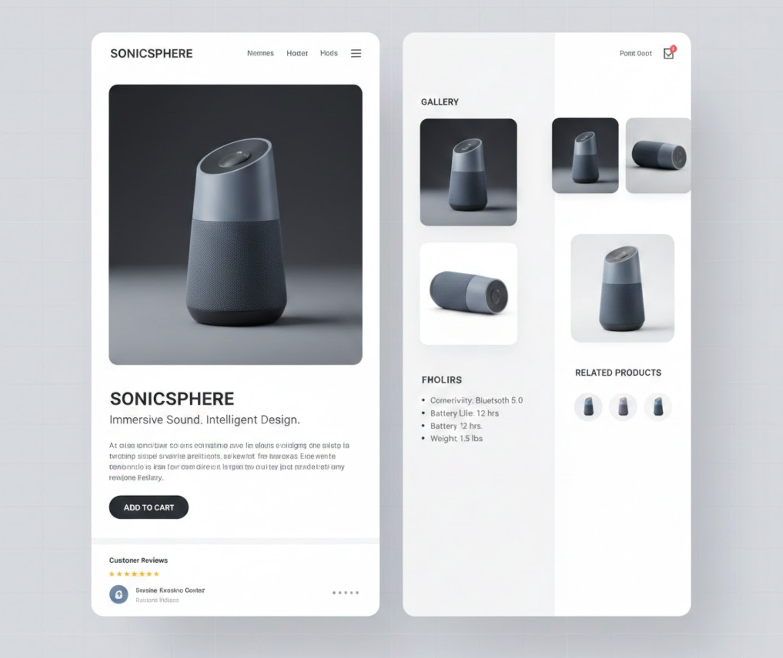
A one-column layout organizes all product elements, images, titles, prices, descriptions, social proof, and calls to action, into a single, uninterrupted vertical flow. This layout mirrors the natural scrolling behavior users are already accustomed to, especially on mobile devices. By revealing information step by step, one-column designs help guide attention, reduce cognitive load, and create a more narrative-driven shopping experience where each section builds upon the previous one.
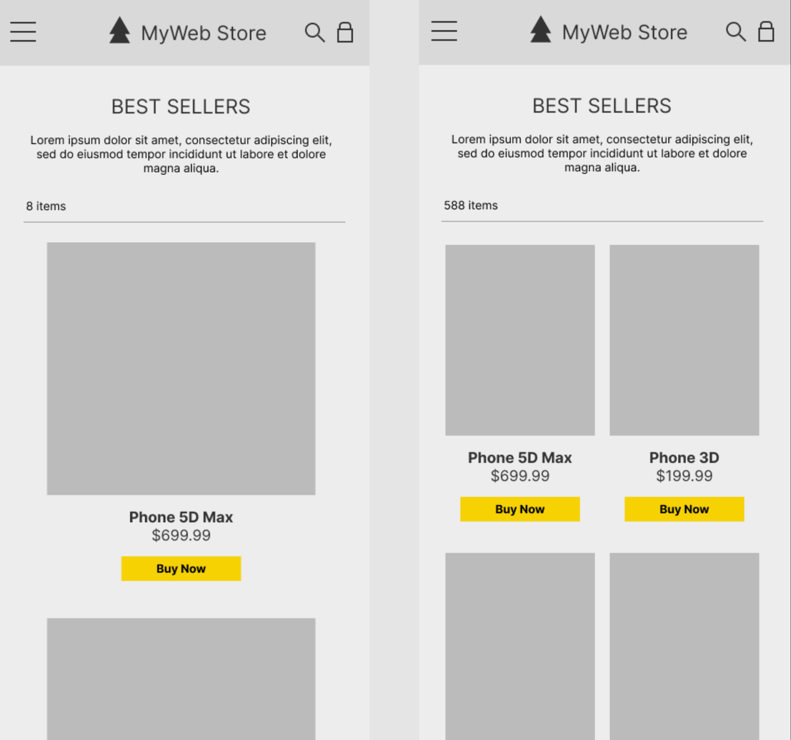
A multi-column layout, by contrast, divides the product page into two or more vertical sections that appear simultaneously on the screen. Most commonly, product images are placed in one column while key details such as pricing, options, and purchase buttons sit alongside them. This structure allows users to scan and compare information quickly without excessive scrolling, making it particularly useful for complex products or shoppers who already know what they are looking for.
At a high level, one-column layouts prioritize focus, simplicity, and guided decision-making, while multi-column layouts emphasize efficiency, visibility, and information density. Understanding how these two approaches differ at a structural level is essential before evaluating their impact on usability, engagement, and conversion performance.
One-column layouts naturally concentrate user attention. Because there is only one visual path to follow, shoppers are less likely to miss key information. This layout supports storytelling, guiding users from product visuals to benefits, proof, and purchase in a deliberate sequence.
In contrast, multi-column layouts distribute attention across multiple areas. While this allows users to scan information faster, it can also increase the risk of distraction, especially if columns compete visually. Poor hierarchy can cause users to jump randomly rather than follow a logical decision flow.
Verdict: One-column layouts work better when focus and clarity are priorities, while multi-column layouts require strong visual hierarchy to avoid attention fragmentation.
One-column layouts tend to feel cleaner and more digestible. By stacking content vertically, designers can add generous spacing, clear section breaks, and progressive disclosure. This makes complex information easier to absorb, especially for users unfamiliar with the product.
Multi-column layouts excel at presenting high information density. Specifications, feature lists, pricing tiers, and comparisons can appear side by side, reducing scrolling and making cross-referencing faster. However, if overloaded, these layouts can feel cluttered and mentally taxing.
Verdict: Multi-column layouts are better for dense, structured information, while one-column layouts are better for readability and cognitive ease.
On mobile devices, one-column layouts are the clear default. They align naturally with vertical scrolling and touch interaction, making them intuitive and easy to navigate. Users rarely need to zoom, pan, or adjust their focus.
Multi-column layouts often collapse into a single column on mobile, which can disrupt the intended structure. If not thoughtfully adapted, important elements like CTAs or key details may be pushed too far down the page.
Verdict: One-column layouts consistently perform better on mobile, while multi-column layouts demand careful responsive design to remain effective.
One-column layouts support guided decision-making. By controlling the order of information, problem, solution, benefits, proof, CTA, they help users build confidence step by step. This is especially effective for emotional or high-consideration purchases.
Multi-column layouts encourage self-directed exploration. Users can jump directly to the information they care about, such as price, variants, or specs. This suits confident shoppers who already know what they want.
Verdict: One-column layouts are stronger for persuasion and storytelling, while multi-column layouts work better for fast, goal-oriented decision-making.
The effectiveness of each layout heavily depends on the product being sold.
Verdict: Neither layout is universally superior, the product’s complexity and buying context should dictate the choice.
One-column layouts often feel faster, even if actual load times are similar. The linear structure allows content to load progressively, giving users immediate visual feedback and reducing perceived waiting time.
Multi-column layouts may load more elements above the fold at once, which can slow initial rendering if not optimized. This can subtly increase bounce rates, especially on slower connections.
Verdict: One-column layouts generally create a smoother perceived performance, particularly on mobile and low-bandwidth devices.
One-column layouts are easier to maintain and scale. Adding new sections, FAQs, reviews, upsells, rarely disrupts the overall structure. This makes them ideal for evolving product pages.
Multi-column layouts offer greater flexibility for advanced merchandising, but they require more design oversight. Adding or removing elements can break balance and alignment if not handled carefully.
Verdict: One-column layouts are more scalable, while multi-column layouts offer more design power at the cost of complexity.
Yes, and in many modern ecommerce experiences, the best solution is a hybrid approach.
A common pattern is using a multi-column layout above the fold, where product images and key purchase details appear side by side, followed by a one-column layout below the fold for descriptions, benefits, reviews, and FAQs. This combines fast access to critical information with a focused, story-driven experience.
Another effective method is responsive hybridization: multi-column on desktop for efficiency, and one-column on mobile for clarity. When done intentionally, this approach delivers the strengths of both layouts without their downsides.
Choosing between one-column and multi-column layouts is less about finding a universal winner and more about understanding how each structure supports different user behaviors and shopping contexts. One-column layouts excel at guiding attention, reducing cognitive effort, and creating a clear, story-driven path toward conversion, making them especially effective for mobile users and products that benefit from explanation and persuasion. Multi-column layouts, meanwhile, offer efficiency and visibility, allowing shoppers to scan, compare, and act quickly when they already have clear intent or need to evaluate multiple details at once.
In practice, the most effective product pages often blend these approaches rather than relying on one exclusively. By combining a multi-column structure for immediate access to key information with a one-column flow for deeper content and reassurance, brands can accommodate both fast decision-makers and more deliberate shoppers. Ultimately, the best layout is the one that aligns with your product complexity, audience expectations, and device usage, supporting the decision-making process naturally instead of forcing it.

