Please select the platform to login


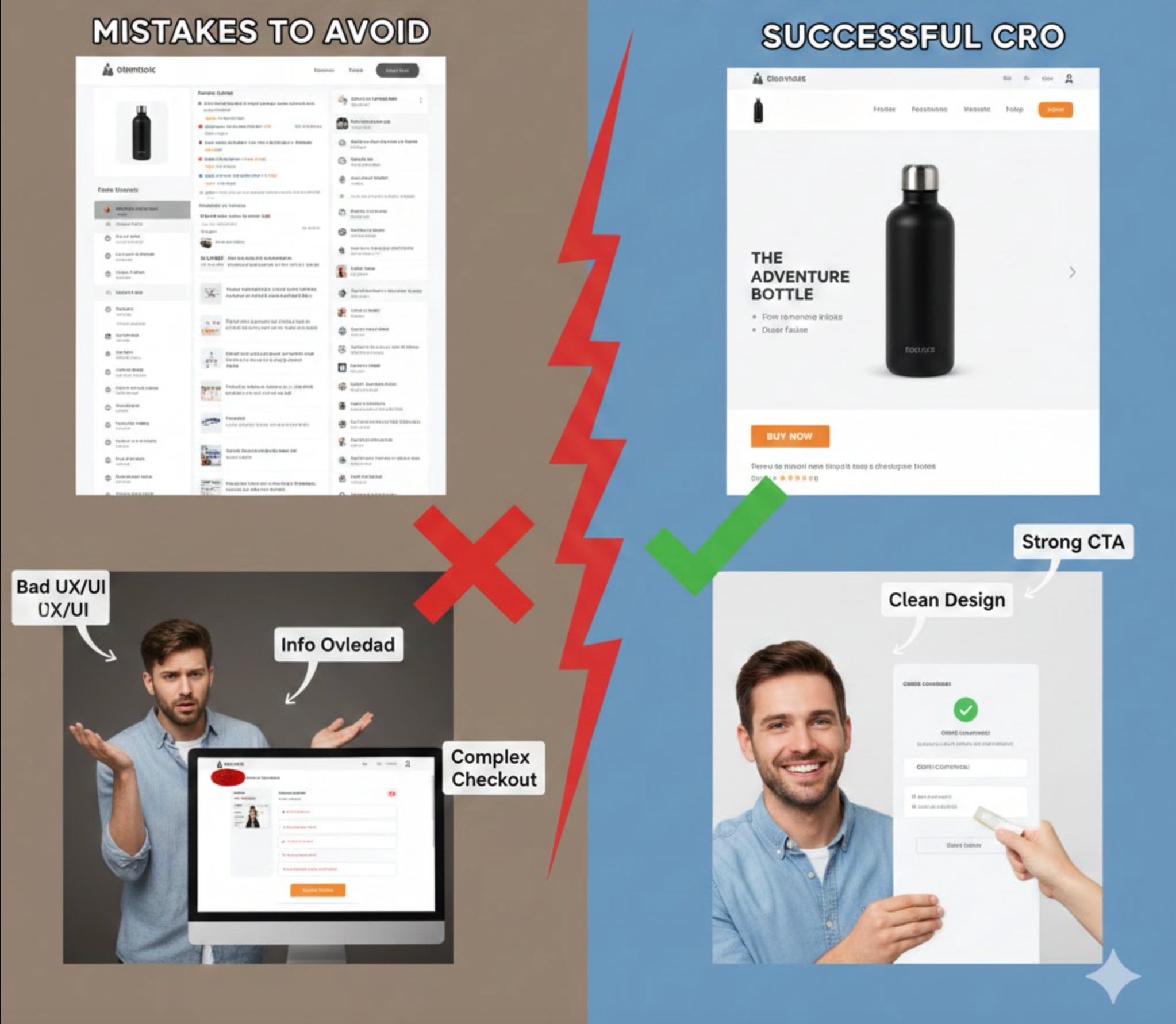
Running a one-product store gives you a unique advantage: absolute focus. With only one offer to highlight, you can craft a tightly optimized journey that moves visitors from curiosity to purchase quickly and convincingly. However, this narrow focus also magnifies every conversion mistake. A single weak section, unclear message, or misaligned expectation can cause significant revenue loss because shoppers have no alternative product pages to explore. That’s why understanding the most common CRO pitfalls is crucial if you want your one-product store to consistently convert.
Below are the major one-product store CRO mistakes to avoid, along with explanations and transitions that show how each issue affects the next stage of the customer journey.
If visitors don’t instantly understand what your product is, who it’s for, and why it’s better than alternatives, they’ll bounce before scrolling. One-product stores rely heavily on a sharp, top-of-page message, yet many end up with vague taglines that sound nice but say nothing.
A weak value proposition also disrupts the flow of the entire page. When users start confused, everything that follows feels less persuasive because they’re not sure what problem the product solves.
To ensure visitors immediately grasp your promise, you should:

A one-product store must be laser-sharp in explaining transformation—yet many highlight a long list of technical features with no meaningful context. While features have a place, benefits are what make customers visualize improvement and justify paying premium pricing.
When visitors see too many specs without clear value, they feel overwhelmed rather than informed. This leads to friction, which is one of the biggest conversion killers.
To shift from overwhelming details to compelling reasons to buy, focus on:
Because you sell only one product, your visuals must carry most of the persuasion weight. But many one-product stores use mixed styles, low-resolution photos, or overly edited images that reduce trust rather than build it.
Inconsistent visuals also break the narrative flow. When the same product looks different across sections, visitors subconsciously question authenticity.
To strengthen trust and reinforce a cohesive brand story, consider:

One-product stores often add reviews simply because they’re required, but not because they’re strategically placed. Poor timing, like placing reviews too low or dumping them in a cluttered layout, makes them less effective at relieving purchase anxiety.
A strong flow matters: social proof should confirm key claims right when the shopper starts questioning them.
To ensure social proof supports each persuasion moment, aim to:
Because the entire business runs on a single product page, speed issues hit harder. Sluggish loading kills conversions, especially on mobile. Even a one-second delay can be enough for users to lose patience, exit, and never return.
Moreover, slow loading breaks the psychological momentum that one-product funnels rely on. Users need a smooth scroll experience to stay engaged.
To create a frictionless, fast-loading experience, start by:
Some one-product stores make the CTA too soft, too aggressive, or too vague. Others scatter multiple different CTAs across the page, making the user unsure what the primary action should be.
A clear, consistent CTA is crucial because the entire page exists to guide users toward one decision.
To make your CTA strategy more intentional and persuasive, focus on:

Every buyer has doubts, and in a one-product store, any unanswered question becomes a conversion barrier. Many stores skip FAQs or write them generically, leaving shoppers uncertain about sizing, shipping, material quality, or guarantees.
Because visitors have nowhere else to explore, missing answers equals lost sales.
To reduce hesitation and address concerns upfront, include:
Some one-product brands don’t test at all, assuming their product is too simple to need optimization. Others run tests on trivial details instead of focusing on high-impact elements like messaging, headlines, or hero media.
Without structured testing, you’re guessing, and guesses rarely improve conversions in meaningful ways.
To generate meaningful insights that boost conversion rates, start by:
Visitors need reassurance every few scrolls, but many pages separate trust elements into a single area, often too low to matter. In a one-product store, trust must be reinforced through context, not dumped in one place.
Missing reassurance signals cause hesitation, especially for first-time buyers who don’t know your brand yet.
To reinforce credibility at every stage of the journey, try adding:
CRO doesn’t end at the purchase button. Many one-product stores fail to monetize with bundles, one-click upsells, or post-purchase offers. This limits revenue potential and increases the dependency on ads for profit.
Even a simple “Buy 2, Save X%” bundle can dramatically increase AOV if implemented smoothly.
To capture additional revenue without hurting user experience, consider:
A one-product store can scale rapidly when optimized correctly because every conversion improvement directly boosts profitability. But the same simplicity also means every mistake feels bigger. By strengthening your value proposition, clarifying your benefits, optimizing visuals, and reinforcing trust throughout the page, you create a conversion path that feels effortless, and therefore more persuasive.
Avoid these common CRO mistakes, and your one-product store will operate like a high-performance sales engine built to convert consistently and predictably.

