Please select the platform to login


Mobile eCommerce has become the primary way consumers browse online stores. For many brands, most of the traffic now comes from smartphones. However, despite this high traffic volume, mobile conversion rates often lag behind desktop. The reason is simple: mobile shopping introduces more friction. Smaller screens, slower perceived loading speeds, and constant distractions make it harder for users to stay focused and complete a purchase.
This is where Quick View plays a critical role.
When implemented strategically, Quick View helps bridge the gap between browsing and buying. It allows shoppers to explore products quickly, compare options effortlessly, and take action without being interrupted by page reloads. On mobile, where every extra tap matters, Quick View is not just a design enhancement, it is a powerful conversion optimization feature.
In this article, we will explore what Quick View means in a mobile eCommerce context, why it is especially important for mobile users, and the best practices that ensure Quick View improves usability, engagement, and sales rather than adding friction.
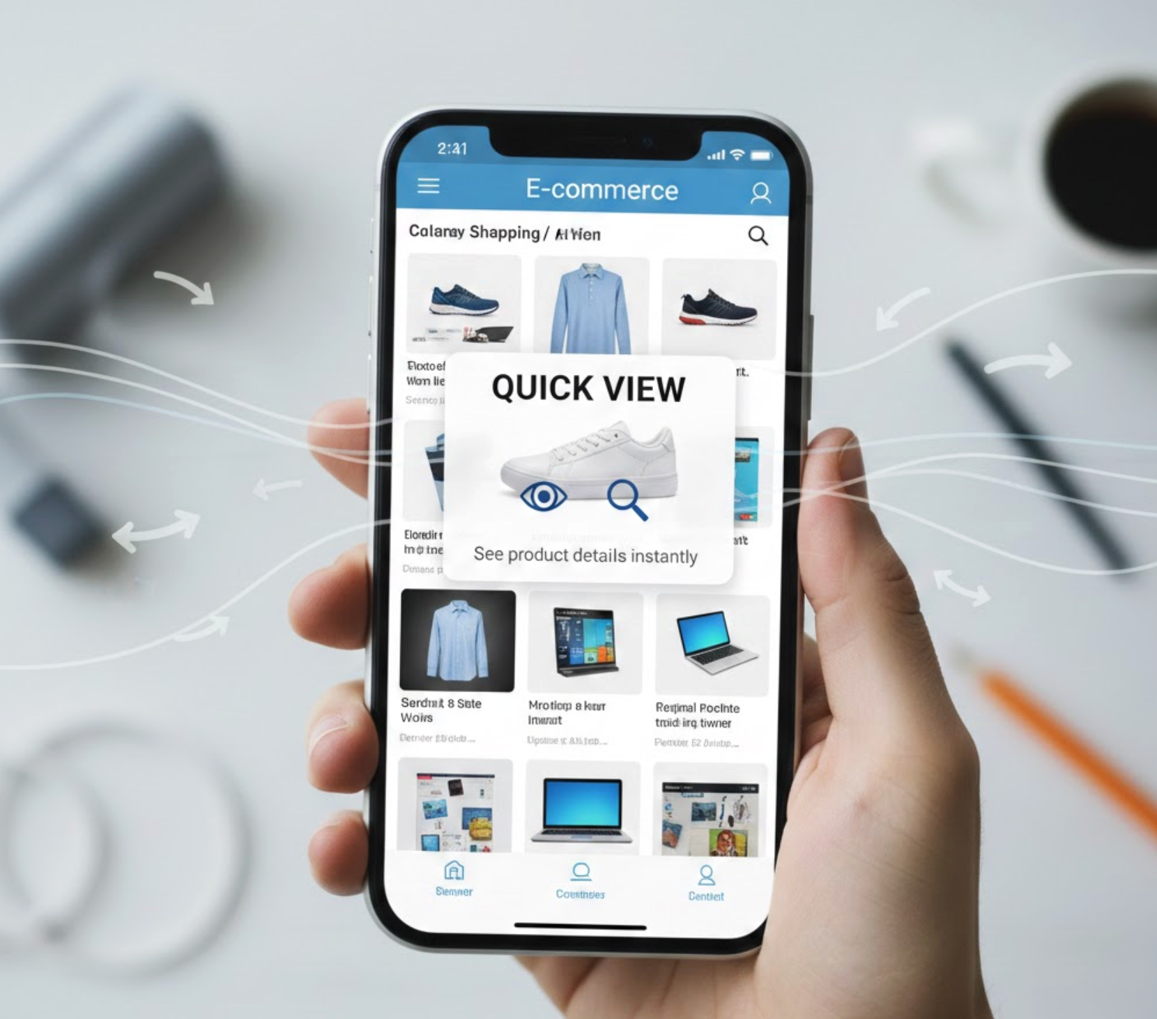
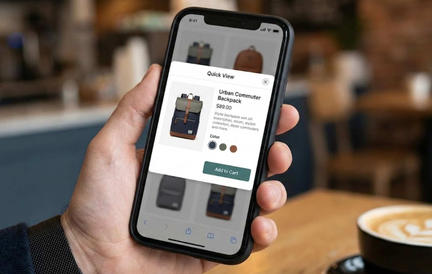
Quick View is a feature that allows shoppers to see essential product information in an overlay, such as a modal or bottom sheet, without leaving the page they are currently browsing. On mobile devices, Quick View is typically triggered by tapping a “Quick View” button or the product card itself.
Unlike desktop Quick View, which often appears as a centered pop-up, mobile Quick View is usually designed as a full-width or bottom-up panel. This format aligns better with touch-based interaction and vertical scrolling patterns that mobile users are already familiar with.
A well-optimized mobile Quick View generally includes:
The goal is not to show everything the product page contains, but rather to provide just enough information to help shoppers decide whether to add the item to their cart or explore further.
While Quick View is useful on all devices, its value increases significantly on mobile due to several behavioral and technical factors. Understanding these differences helps explain why Quick View deserves special attention in mobile eCommerce strategies.
Mobile shoppers often browse while multitasking—during short breaks, while commuting, or between other activities. Each page transition increases the risk of distraction or abandonment. Quick View helps maintain focus by keeping users in the same browsing flow.
Even when a site is technically fast, page loads feel slower on mobile due to network variability and device limitations. Quick View reduces the number of full page loads, making the experience feel faster and more responsive.
Mobile users tend to scroll and scan more than desktop users. They often want to glance at multiple products before committing to one. Quick View supports this behavior by enabling rapid comparison without resetting scroll position or navigation context.
Together, these factors make Quick View a natural fit for mobile shopping experiences focused on speed, continuity, and ease of use.
Mobile Quick View must be designed with one-handed use in mind. Since most users interact with their phones using their thumbs, placement and sizing of interactive elements are critical.
To ensure comfort and accuracy, you need to:
When users can interact naturally without adjusting their grip or zooming, Quick View feels effortless rather than forced.
One of the most common mistakes in mobile Quick View design is trying to include too much information. While it may be tempting to replicate the product page, doing so defeats the purpose of Quick View.
Instead, focus on decision-critical information, such as:
Lengthy descriptions, technical specifications, and long-form content should remain on the product page. A short, well-written summary paired with a “View Full Details” link gives users control without overwhelming them.
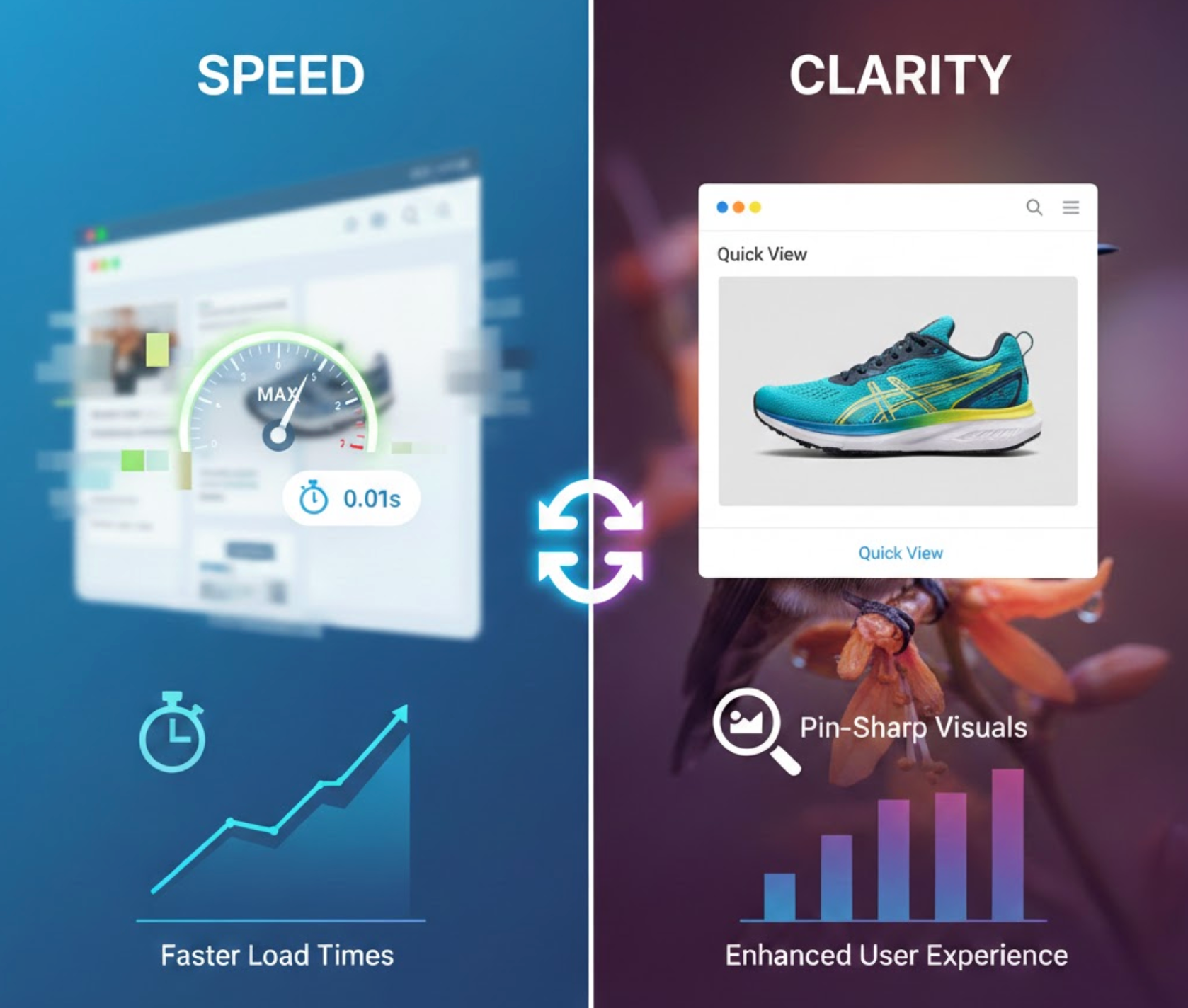
Images often determine whether a shopper feels confident enough to add a product to their cart. At the same time, images are one of the biggest performance bottlenecks on mobile.
To strike the right balance:
By prioritizing fast-loading visuals, Quick View reinforces trust and reduces perceived wait time.
Variant selection is a critical step that can either enable or block conversions. On mobile, poorly designed variant controls often force users to leave Quick View altogether.
To minimize friction:
The easier it is to complete variant selection, the more likely users are to complete the Add to Cart action within Quick View.
The ultimate purpose of Quick View is to shorten the path to adding products to the cart. Therefore, the Add to Cart experience must be obvious, responsive, and reassuring.
Here are the best practices you can try:
A smooth Add to Cart interaction builds momentum and encourages shoppers to continue browsing or proceed to checkout.
On mobile devices, bottom sheet modals often outperform traditional pop-ups. They feel more native, more intuitive, and less intrusive.
Bottom sheet Quick Views:
This design choice alone can significantly improve engagement and reduce frustration.
Quick View should enhance navigation, not complicate it. Poor handling of scroll behavior or back-button actions can quickly frustrate users.
To maintain a smooth experience:
When Quick View feels integrated rather than layered on top, users are more likely to trust and use it.
Finally, it’s important to evaluate Quick View performance specifically for mobile users. Desktop metrics do not always reflect mobile behavior accurately.
Key metrics to monitor include:
By analyzing this data, you can refine content length, layout, and interaction patterns to better serve mobile shoppers.
Quick View is designed to simplify mobile shopping, but when implemented incorrectly, it can unintentionally create friction instead of reducing it. Many stores add Quick View with good intentions, yet overlook key mobile usability principles. As a result, the feature may exist visually but fail to improve engagement or conversions.
To avoid these issues, it’s important to understand where Quick View implementations commonly go wrong.
Quick View is more than a convenience feature, it is a strategic tool for improving mobile eCommerce performance. When designed with mobile users in mind, it reduces friction, maintains browsing momentum, and supports faster purchasing decisions.
The most effective mobile Quick View experiences are fast, focused, and intuitive. They respect users’ time, attention, and physical interaction patterns while providing exactly what is needed to move closer to checkout.
For stores that rely heavily on mobile traffic and collection page browsing, applying these Quick View best practices can lead to measurable improvements in engagement, usability, and revenue.

