Please select the platform to login


In eCommerce design, every interaction influences how users perceive and experience a store, and scrolling is one of the most fundamental yet underestimated behaviors. Since shoppers rely heavily on scrolling to browse products, compare options, and absorb information, the way content appears during scroll can significantly affect engagement and conversions. When scroll behavior feels smooth and predictable, users focus on shopping rather than navigation. On the other hand, poorly designed scrolling can create friction, confusion, and even mistrust.
This beginner’s guide takes a deeper look at what scroll behavior means in eCommerce, why it matters, and how to design scrolling experiences that feel natural while gently guiding users toward purchase decisions.

Scroll behavior refers to how content loads, moves, and responds as users scroll through a page. This includes the speed at which content appears, whether elements remain fixed or disappear, and how additional information is revealed over time. In eCommerce environments, scroll behavior directly affects how users explore product catalogs, understand value propositions, and evaluate purchasing options.
Rather than forcing shoppers to navigate through multiple clicks and page reloads, modern eCommerce design relies on scrolling to deliver content in a continuous, story-like flow. When this flow feels intentional and well-structured, users feel oriented and in control. However, when scroll behavior is inconsistent or cluttered, users may struggle to understand where to focus or what to do next.

Scrolling may seem like a simple interaction, but it plays a major role in shaping perception, trust, and usability. The way a page unfolds while scrolling influences how much effort users feel they are investing and whether they believe the store is worth their time.
Understanding common scroll patterns helps beginners choose the right approach for different pages and user goals. Each type of scroll behavior serves a specific purpose and comes with its own design considerations.
Traditional vertical scrolling is the most familiar pattern for users and remains the backbone of most eCommerce pages. It works especially well for category pages, product listings, and content-heavy landing pages.
Because users instinctively know how this scrolling works, it minimizes cognitive effort and allows them to focus on content. The main challenge is maintaining clarity as the page grows longer.
Infinite scrolling continuously loads new content as users reach the bottom of a page, creating a seemingly endless browsing experience. This pattern is commonly used for large product catalogs or inspiration-driven shopping experiences.
While infinite scrolling can increase engagement, it also requires careful planning to avoid disorientation or fatigue. Users should always feel aware of their position and progress.
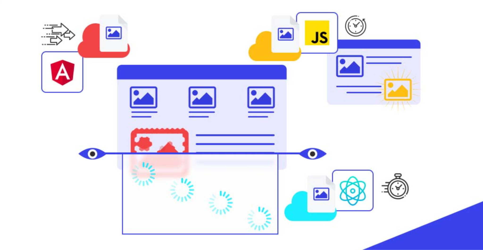
Lazy loading delays the loading of images or content until they are about to enter the user’s viewport. This technique improves page speed and performance, especially on image-heavy eCommerce sites.
When executed properly, lazy loading feels invisible to users. However, if content loads too late or shifts the layout, it can disrupt the scrolling experience.
Fixed and sticky elements stay visible as users scroll, such as navigation bars, filters, or add-to-cart buttons. These elements reduce friction by keeping essential actions within easy reach.
Sticky elements, for example sticky add to carts, are powerful when used intentionally but can quickly become intrusive if overused. Balance is key to maintaining usability.
Scrolling naturally controls the rhythm of how users consume information. As users move down a page, their attention shifts based on expectations, visual cues, and cognitive load.
At the top of the page, users focus on understanding context and relevance. As they scroll, they transition into exploration mode, scanning for details, reassurance, and comparisons. Toward the bottom, attention often decreases unless the content clearly signals continued value.
Designing effective scroll behavior requires balancing content density, performance, and user comfort. These best practices help beginners create scrolling experiences that feel effortless rather than overwhelming.
A clear visual hierarchy ensures users always know where to focus as they scroll. Without hierarchy, long pages quickly feel confusing and tiring.
Long pages are not inherently bad, but overcrowded pages are. Showing too much information at once increases cognitive load and decision fatigue.
Performance issues during scrolling immediately harm trust and usability. Even small delays or stutters can make a site feel unprofessional.
Mobile users rely almost entirely on scrolling, making scroll behavior even more critical on small screens. Thumb reach, load speed, and layout stability all affect usability.
Scroll-triggered animations and micro-interactions can enhance feedback and engagement when used thoughtfully. These subtle effects help users understand relationships between content and actions.
However, too many scroll-triggered effects can distract users from shopping goals. Simplicity and purpose should guide every interaction.
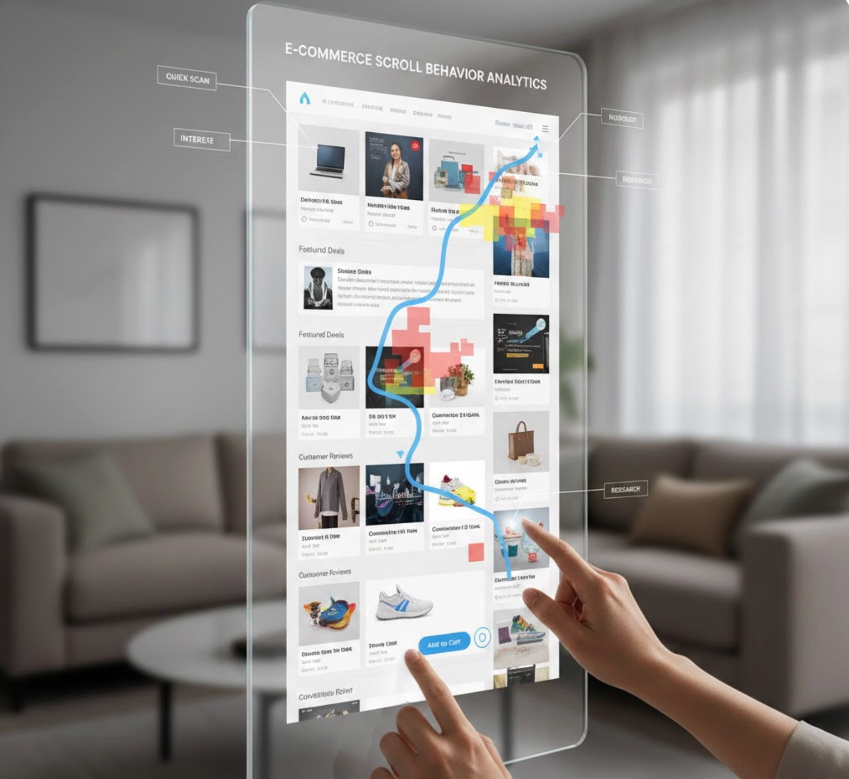
Improving scroll behavior requires understanding how users actually interact with pages. Analytics and behavioral tools provide valuable insight into real scrolling patterns.
Scroll depth, heatmaps, and session recordings reveal where users slow down, stop scrolling, or abandon a page. These insights help refine layout, content order, and pacing.
Scroll behavior plays a surprisingly large role in eCommerce success, even though it often goes unnoticed by users. For beginners, the focus should be on clarity, comfort, and predictability rather than complex visual effects. When scrolling feels smooth and intentional, users stay engaged and feel confident exploring the store.
By understanding scroll patterns, respecting user attention, and continuously testing performance, eCommerce designers can transform scrolling from a basic interaction into a powerful tool that supports usability, trust, and conversions.

