Please select the platform to login


A well-designed search bar can dramatically improve user experience and conversions in an online store. When visitors can quickly find what they want, they’re more likely to buy. However, many Shopify stores still overlook small but crucial details that make their search bars underperform. Let’s explore seven common search bar mistakes and how to fix them for better usability and sales.
The mistake:
Some stores hide the search bar behind menus, icons, or dropdowns, making it hard for users to find. On mobile, accessing a buried search feature often requires multiple taps, which interrupts the shopping flow. Shoppers who can’t find what they need quickly are more likely to leave without purchasing. A hidden search bar also reduces the likelihood of repeated visits since users may associate your store with poor usability.

How to fix it:
Your search bar should be instantly visible and easy to access on every page. Keeping it prominent helps users find products faster and encourages them to use it more often.
Here’s how you can make it more accessible:
The mistake:
Without autocomplete or predictive suggestions, users must type full product names or categories, which takes more time and effort. Many shoppers make spelling errors or abbreviate terms, and if the search doesn’t predict their intent, it may return no results. This leads to frustration and can increase bounce rates. Stores that ignore this feature risk losing sales because users may give up searching altogether.

How to fix it:
Smart autocomplete can greatly enhance user experience by predicting what shoppers are looking for. It saves time, reduces typing effort, and minimizes frustration from spelling errors.
You can improve autocomplete effectiveness by:
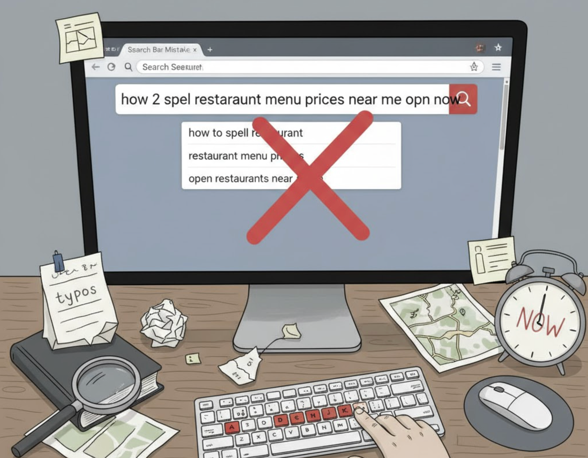
The mistake:
Many search engines fail when users make typos or use alternate terms for the same product. For example, a search for “t-shrt” or “denim jeans” may return zero results even if the items exist. This creates a poor user experience and may cause shoppers to leave the store out of frustration. Over time, failing to account for common misspellings and synonyms can reduce overall engagement and hurt sales.

How to fix it:
Your search engine should understand user intent even when words aren’t typed perfectly. Supporting typos and synonyms ensures shoppers always find relevant results instead of dead ends.
Take these steps to make your search more intelligent:
The mistake:
Even when the search engine finds products, poorly organized results confuse users. Showing irrelevant items or out-of-stock products at the top reduces trust in your store’s usability. Shoppers may have to scroll through multiple pages to find what they need, increasing the chance of abandonment. A cluttered or random order makes it harder for customers to quickly complete purchases.
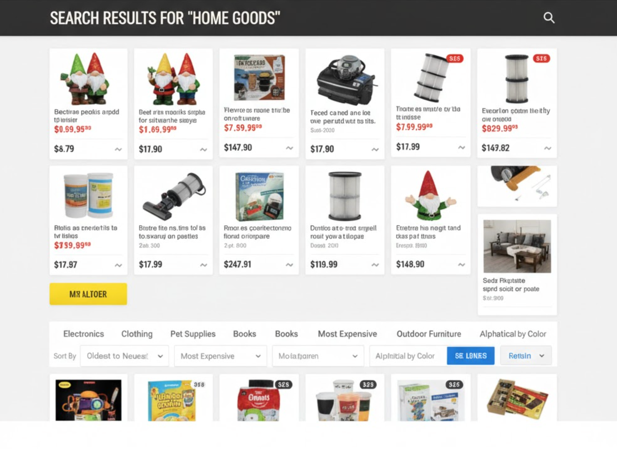
How to fix it:
Poorly ranked search results confuse shoppers and reduce trust in your store’s navigation. Ensuring relevant and well-ordered results helps users find what they want quickly.
Improve your search result presentation by:
The mistake:
A blank “No results found” page leaves users at a dead end and ends their shopping journey abruptly. Without guidance, shoppers may feel frustrated and leave your store immediately. This is a missed opportunity to showcase alternative products or categories. Stores that ignore this often lose potential sales that could have been captured with better suggestions or navigation.
How to fix it:
A blank “No results found” page ends the user journey prematurely and wastes a sales opportunity. Instead, you can turn it into a valuable discovery page that keeps users browsing.
Make your “No results” pages more engaging by:

The mistake:
Many store owners never review what customers are searching for, which leads to missed opportunities. Without analytics, it’s difficult to understand user intent, identify gaps in the catalog, or optimize product listings. Failed searches go unnoticed, meaning users repeatedly encounter friction. Ignoring this data prevents stores from making informed improvements that could increase conversions and boost engagement.
How to fix it:
Without analyzing search data, you miss valuable insights into what your customers want. Monitoring user behavior helps you identify popular trends and weak spots in your catalog.
Start optimizing your search performance through:
The mistake:
Some stores overload the search bar with too many animations, filters, or visual effects. This slows down performance and distracts users from entering their search queries. Complex designs can also confuse shoppers about how to interact with the search. Ultimately, overcomplicating the interface reduces usability and can lead to lost sales.
How to fix it:
Complex designs with too many effects can slow loading times and distract users from the main goal, finding products. A simple and intuitive search bar improves performance and usability.
You can simplify your search design by:
Your search bar is more than just a text box, but it’s a critical tool that connects users directly to what they want. By avoiding these seven common mistakes and implementing the fixes, you can turn your search feature into a high-performing conversion driver. Focus on visibility, relevance, and usability to create a seamless experience that keeps users engaged and increases sales. A well-optimized search bar can be the difference between a frustrated visitor and a loyal customer.

