Please select the platform to login


As eCommerce product pages become more detailed and content-rich, guiding users toward conversion has become increasingly challenging. Long product pages are excellent for storytelling, education, and trust-building, but they also introduce friction when shoppers are ready to act and can’t immediately find the next step.
This is where sticky CTA buttons play a crucial role. By keeping the primary action visible as users scroll, sticky CTAs ensure that purchase intent is never interrupted by page length. When implemented strategically, they improve usability, reduce hesitation, and support a smoother path to checkout without feeling intrusive or overly promotional.
In this guide, we’ll explore how sticky CTA buttons work, why they are especially effective on long product pages, and the best practices that ensure they enhance, rather than harm, the shopping experience.
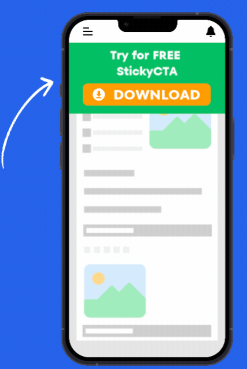
Sticky CTA buttons are call-to-action elements that remain fixed in a consistent position on the screen while users scroll through a page. Unlike traditional CTAs that stay anchored within a single section, sticky CTAs follow the user, ensuring the conversion action is always within reach.
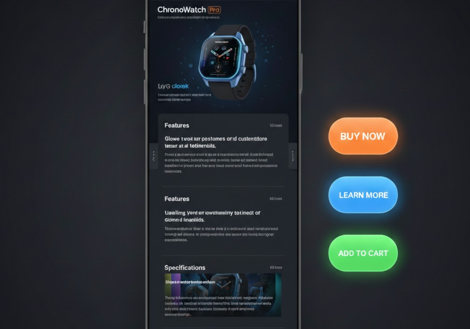
On product pages, these CTAs most commonly take the form of a persistent “Add to Cart” or “Buy Now” button. In many cases, they also include essential product information such as pricing, variant selection, or availability status. This condensed format allows shoppers to make a decision quickly without needing to navigate back to the top of the page.
Because scrolling behavior differs significantly across devices, sticky CTAs are particularly effective on mobile. However, when carefully designed, they can also enhance desktop experiences by reducing unnecessary back-and-forth navigation.
Long product pages are built to answer questions, overcome objections, and build confidence. Shoppers may scroll through feature lists, product images, customer reviews, size guides, and FAQs before feeling ready to purchase. Unfortunately, by the time that decision is made, the primary CTA is often far out of view.
Sticky CTA buttons solve this problem by aligning the conversion action with the moment of intent. Instead of forcing users to scroll back up, the CTA remains accessible exactly when motivation is highest.
In addition, sticky CTAs help:
As a result, sticky CTAs don’t just improve convenience, they actively support higher conversion rates by removing unnecessary friction.
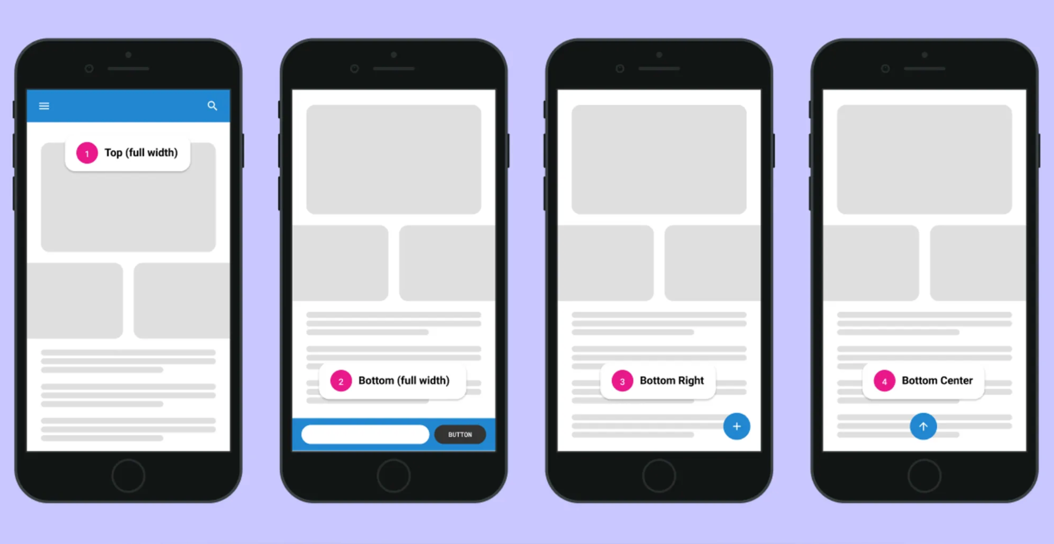
A sticky CTA should appear as a response to user behavior, not as an immediate demand for action. Showing it too early can feel aggressive and may distract users who are still exploring the product. Timing its appearance properly ensures the CTA feels helpful rather than pushy.
Once users scroll past the main product CTA, the sticky version naturally takes over as a guide toward the next step.
Because sticky CTAs stay visible throughout the scroll, excessive design quickly becomes overwhelming. Large buttons, bold animations, or dense layouts can distract users from product content. A minimal design helps the CTA remain supportive instead of dominating the screen.
When the design stays simple, users can focus on the product while still knowing exactly where to act.
Most long-scroll behavior happens on mobile devices, where reaching the main CTA can be inconvenient. A mobile-optimized sticky CTA reduces friction by keeping the action within thumb reach. Without proper optimization, however, it can easily block content or frustrate users.
Designing with mobile constraints first ensures the sticky CTA enhances usability instead of harming it.
Sticky CTAs are meant to assist decisions, not repeat the entire product section. Including too much information can overwhelm users and reduce clarity. A focused layout reinforces purchase intent without interrupting the reading flow.
By highlighting only what matters, the CTA stays lightweight and effective.
Variant selection is a common source of friction during checkout. If the sticky CTA ignores required options, users may encounter errors or confusion. Proper variant handling ensures a smooth and predictable experience.
When the sticky CTA mirrors the main product form, users feel confident moving forward.
A sticky CTA should stand out without overpowering the page. Strong visual hierarchy helps users identify the action while still prioritizing product content. Brand consistency also plays a key role in building trust.
When the CTA looks and feels familiar, users are more likely to engage.
Sticky CTAs are not one-size-fits-all solutions. Their impact varies depending on product type, audience behavior, and page structure. Continuous testing helps identify what truly works for your store.
With data-driven adjustments, sticky CTAs can remain effective over time.
Sticky CTA buttons are not about pushing users to buy faster, they are about removing unnecessary barriers when users are already ready to act. On long product pages, they bridge the gap between persuasion and conversion by keeping the next step visible and accessible at all times.
When designed with restraint, clarity, and user intent in mind, sticky CTAs become a powerful usability enhancement. By following these best practices, you can turn long scrolling sessions into smoother, more confident purchasing experiences, and ultimately, higher conversions.

