Please select the platform to login


Your visual identity is the face of your brand. When it’s inconsistent, sloppy, or inaccessible, customers notice, and trust erodes. Below are 10 common visual identity mistakes that quietly undermine credibility, each followed by clear, actionable solutions you can implement today.
Why it hurts:
Your logo is often the first thing people associate with your brand. When it appears stretched, cropped, recolored, or used inconsistently across channels, it confuses your audience and weakens recognition. These inconsistencies make your brand feel unstable and unprofessional — as if you’re not serious about maintaining your image. Customers start to wonder if your business lacks organization or attention to detail. Over time, inconsistent visuals chip away at the trust and familiarity you’ve worked hard to build.
How to fix it:
The key to solving logo inconsistency is to create clear usage rules and make them easily accessible. Define the exact proportions, placements, and colors that represent your logo best. Ensure that every version used across marketing, packaging, or digital media follows the same standards.
Here’s how you can bring consistency and control back to your logo usage:
Why it hurts:
Typography isn’t just decoration, but it communicates tone, hierarchy, and brand character. When your font choices are inconsistent, hard to read, or overused, they create confusion and visual fatigue for the reader. If your type hierarchy is unclear, visitors can’t easily navigate your message, and your content loses impact. Poor typography also signals a lack of design knowledge, diminishing professional credibility. A brand with inconsistent or unreadable text looks disorganized and careless, eroding the sense of trust customers feel when engaging with your materials.
How to fix it:
Start by simplifying your font system and setting consistent hierarchy rules. Choose typefaces that reflect your brand personality, whether modern, friendly, or elegant, and stick with them. Test readability across screens to ensure your typography works both in design and in real-world contexts.
Follow these steps to establish a clean and cohesive typographic system:

Why it hurts:
Color is one of the most powerful tools in shaping brand perception. A weak or inconsistent color palette confuses users, reduces recognizability, and can even make content unreadable. If your color choices lack contrast or harmony, your visuals feel messy or emotionally disconnected. Customers may not consciously recognize the problem, but they’ll subconsciously sense inconsistency and lose confidence in your professionalism. Colors should work together to create a clear, memorable impression, not compete for attention or cause strain.
How to fix it:
Create a well-balanced palette that reflects your brand’s emotion and tone. Define a primary set of colors for identity and accents that add energy or differentiation. Consistent color usage across all materials ensures instant recognition and reinforces brand trust.
Use these actions to build and maintain a strong, cohesive color system:
Why it hurts:
Visuals tell stories faster than words, and when those visuals are low-quality, pixelated, or clearly generic stock photos, they cheapen your entire brand. Generic imagery makes your business appear unoriginal or disconnected from real customers. If people sense that your visuals don’t reflect your true values or audience, they’ll question the authenticity of your brand. High-quality, emotionally resonant visuals build trust, while poor ones send the message that you cut corners or don’t care about presentation.
How to fix it:
Focus on creating or sourcing images that reflect your real brand values and audience lifestyle. Invest in professional photography or choose high-quality stock images that look authentic, not staged. Keep your visual style consistent in lighting, tone, and subject matter.
Here’s how to elevate your brand’s imagery and make it feel authentic:
Why it hurts:
A cluttered layout overwhelms users and makes it difficult to find important information. When everything competes for attention, nothing stands out, leading to confusion and frustration. People associate disorganized design with poor user experience and lack of professionalism. If customers can’t easily identify your key message or call to action, they’ll leave, assuming your brand lacks clarity or reliability. A clean, well-structured layout communicates focus, confidence, and trustworthiness.
How to fix it:
Simplify your layouts by prioritizing key information and giving it visual space to stand out. Use a clear hierarchy to guide users’ eyes toward the most important elements first. Remember, less clutter allows more clarity, and clarity builds confidence.
Apply these layout principles to create cleaner, more effective designs:

Why it hurts:
In a mobile-first world, an unresponsive design is a major credibility killer. When users see broken layouts, overlapping text, or images that don’t scale, they assume your brand is outdated or poorly managed. This frustrates visitors and damages first impressions before they even engage with your content. A design that doesn’t adapt across devices also suggests that you’re not user-centric, which can make people doubt your commitment to quality. Consistency across all screens builds trust and reliability.
How to fix it:
Start by auditing how your brand looks across devices, from large desktops to mobile phones. Identify layout breaks, resizing issues, and text overlaps. Then, design mobile-first to ensure your visuals remain polished and consistent everywhere.
Here’s how to make your brand responsive and user-friendly on every device:
Why it hurts:
When your visuals send one message and your tone of voice sends another, customers get mixed signals. For example, a playful tone paired with rigid, corporate visuals creates confusion about what your brand stands for. Inconsistency between visual and verbal identity can make your communication feel disjointed or inauthentic. People naturally trust brands that feel coherent, where words, colors, and imagery all tell the same story. If your visuals don’t align with your voice, customers may question your reliability or sincerity.
How to fix it:
Start by defining your brand personality, is it friendly, bold, elegant, or practical? Then, align your design elements (colors, fonts, images) with that identity. When your visual and verbal tones match, your brand feels more authentic and relatable.
Take these steps to synchronize your visual and verbal branding:
Why it hurts:
Trendy designs can make your brand look modern for a while, but once the trend fades, your visuals quickly feel dated. Overusing popular design styles also makes your brand blend in with competitors, making it harder to stand out or be remembered. A brand that constantly changes its aesthetic appears indecisive or lacking in self-identity. Customers want familiarity and consistency, qualities that design fads rarely support. Without a distinct visual foundation, your brand risks losing recognition and long-term loyalty.
How to fix it:
Focus on building a timeless foundation based on your brand’s unique story and values. Use design trends only to refresh, not redefine, your visual identity. Consistency in your core elements, logo, color, and tone, will ensure your brand remains recognizable regardless of shifting aesthetics.
Use these methods to stay relevant without losing authenticity:
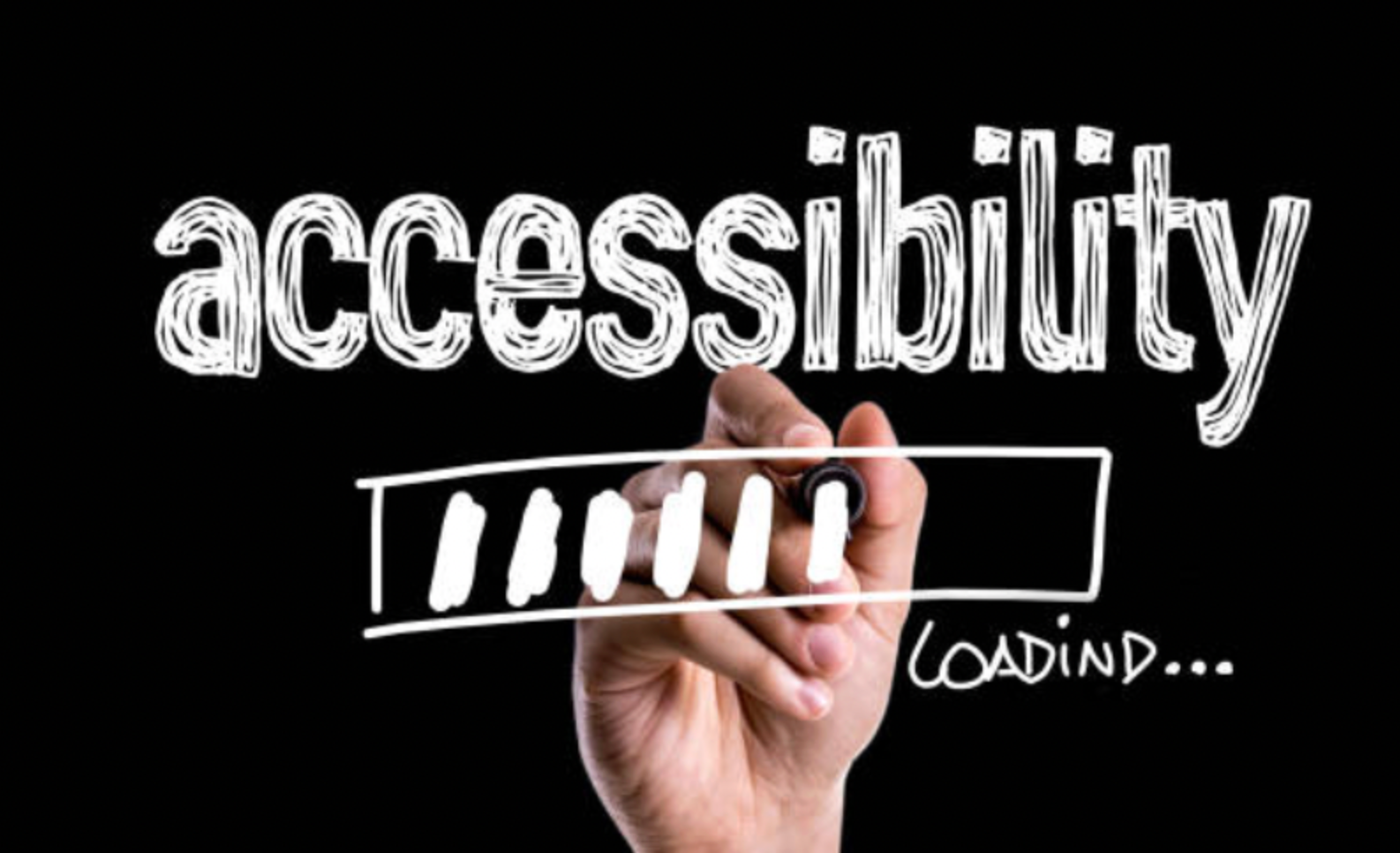
Why it hurts:
Accessibility isn’t just about compliance, it’s about inclusion and respect for your audience. When users with disabilities can’t navigate your website or understand your visuals, they feel excluded and undervalued. This not only reduces your reach but also damages your brand’s reputation as socially responsible. Poor contrast, unreadable fonts, or missing alt text can frustrate users and lead to negative experiences. Accessibility demonstrates empathy, and brands that prioritize it earn greater trust and loyalty from all users.
How to fix it:
Incorporate accessibility from the start, not as an afterthought. Use design tools to test contrast, check font sizes, and ensure visual clarity for all users. Building inclusive experiences shows care and positions your brand as credible and ethical.
Here’s how to make your visual identity accessible to everyone:
Why it hurts:
Without clear and enforced brand guidelines, every team or vendor ends up creating their own version of your brand. Over time, this results in visual chaos, inconsistent colors, mismatched typography, and off-brand imagery that erode recognition. Customers start to see a fragmented identity that lacks authority and professionalism. The absence of a unified standard makes your brand appear unreliable and inconsistent in its messaging. Consistent enforcement ensures your brand looks cohesive and credible across every touchpoint.
How to fix it:
Develop a centralized, easy-to-access brand guide that anyone in your organization can use. Keep it simple, visual, and actionable, focusing on the core elements that define your identity. Regularly review materials to ensure everyone stays aligned with the established rules.
Follow these steps to create and maintain brand consistency across all channels:
Visual trust is built from consistent, clear, and considerate design choices. Fixing the mistakes above doesn’t require creative heroics, but it requires discipline, structure, and attention to detail. Start by auditing your brand assets, defining your core rules, and enforcing them across every platform. A visually consistent identity not only looks professional but also communicates reliability, care, and authenticity, the foundation of lasting brand trust.

