Please select the platform to login


In eCommerce, the checkout page is the most decisive moment in the customer journey. A shopper may have browsed your products, read reviews, and added items to their cart, but if the checkout feels untrustworthy or overly complicated, they are likely to abandon the purchase.
That’s why checkout design is not just about aesthetics. It’s about creating a secure, seamless, and transparent experience that reassures buyers their money and personal information are safe. In this article, we’ll explore how checkout design influences buyer trust and share practical strategies to improve your conversions.
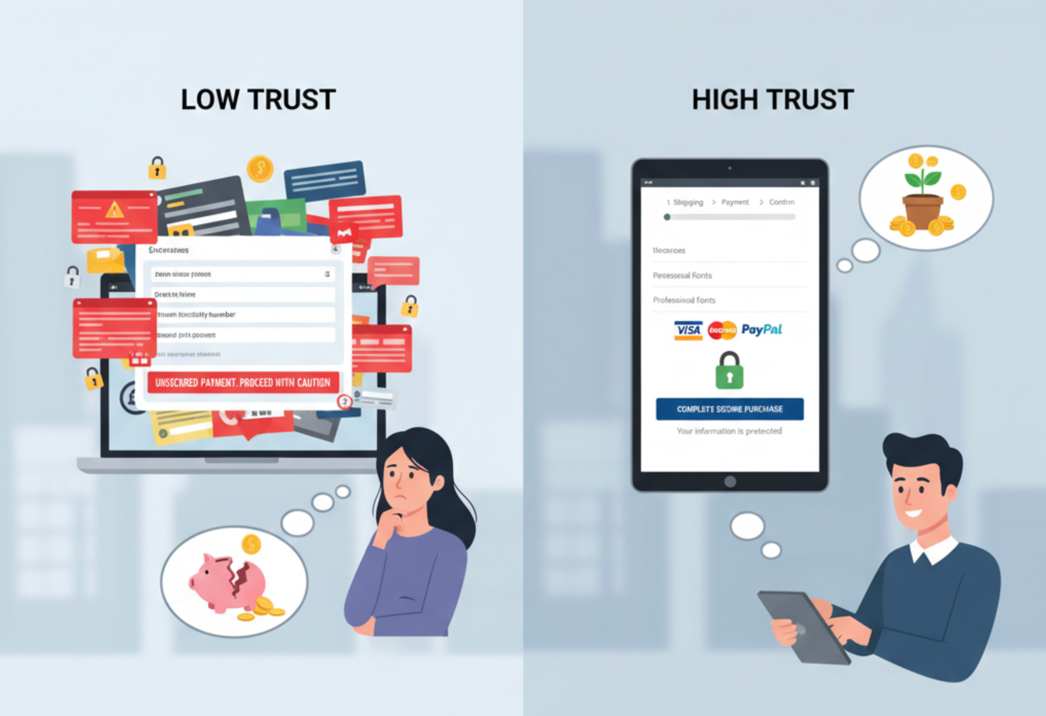
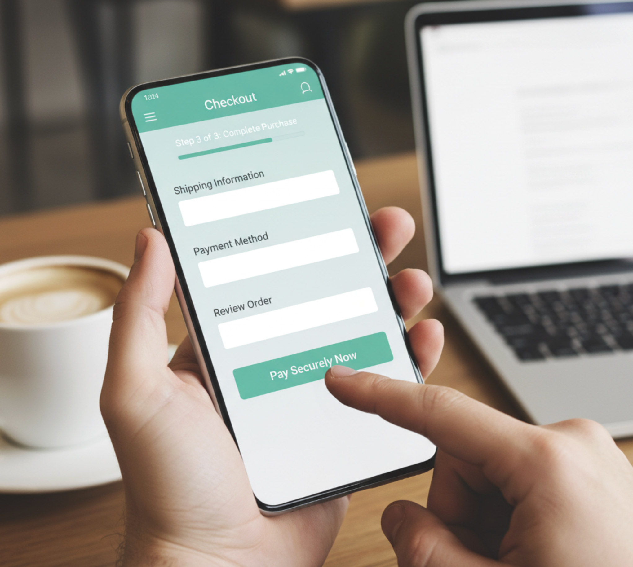
Clutter is the enemy of trust. A messy or confusing checkout design overwhelms customers, making them second-guess the process. Instead, buyers want clarity: each step should be obvious, straightforward, and predictable.
When checkout feels intuitive, buyers are more likely to trust the process and complete their order.
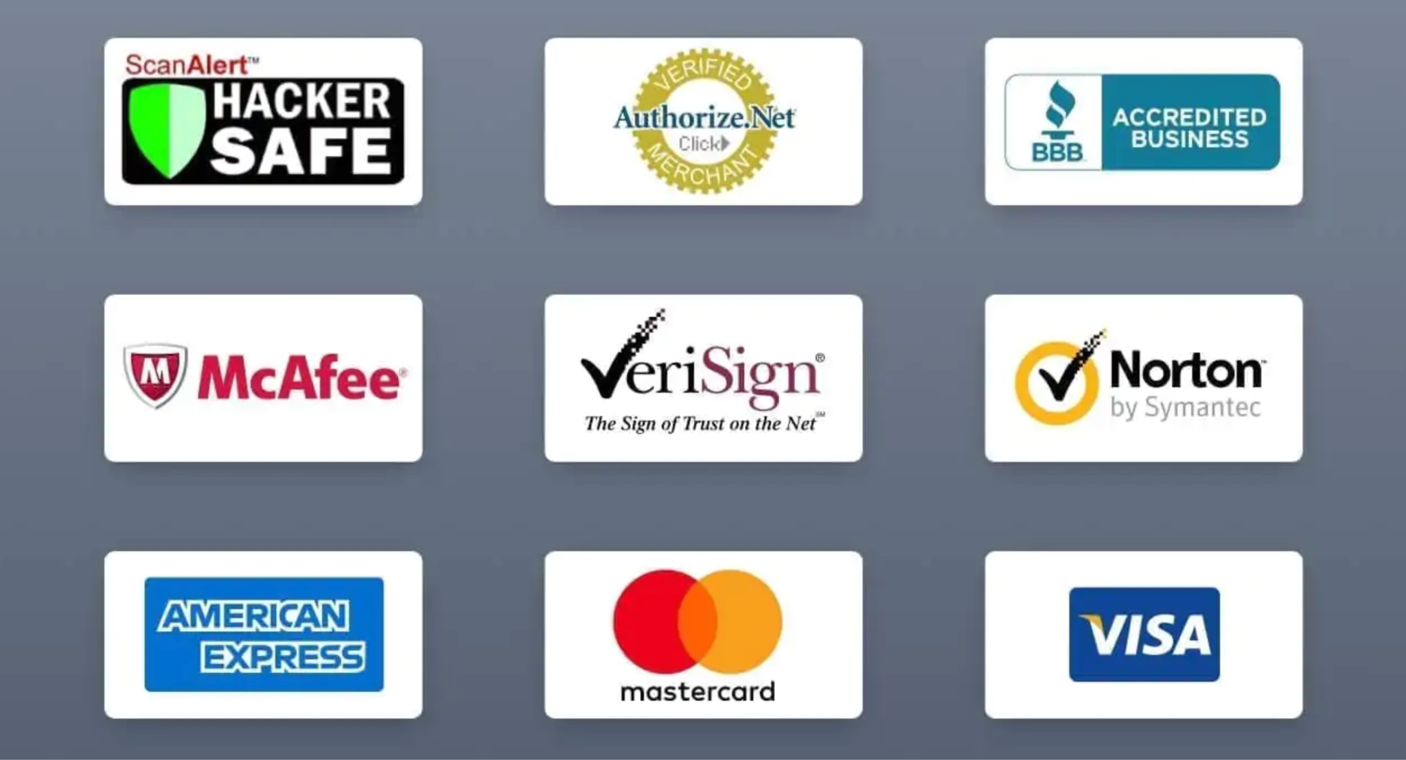
Payment is a sensitive step. Without trust, customers won’t hand over their credit card details. That’s where security signals come in.
The combination of visible trust badges and behind-the-scenes encryption creates psychological assurance, making buyers feel safe.
Few things destroy trust faster than surprise charges. Hidden fees that appear at the last step are a top reason for cart abandonment.
Honesty in pricing not only improves trust but also encourages repeat purchases.
Forcing customers to create an account before buying adds unnecessary friction. While collecting customer data is useful for marketing, it should never come at the expense of trust.
This flexibility signals respect for the customer’s time, which builds loyalty and trust.
With mobile commerce accounting for more than 60% of online sales, a checkout that doesn’t work well on mobile devices will cost you trust, and conversions.
When mobile users experience a checkout that feels smooth and professional, they are more likely to trust your store and return.
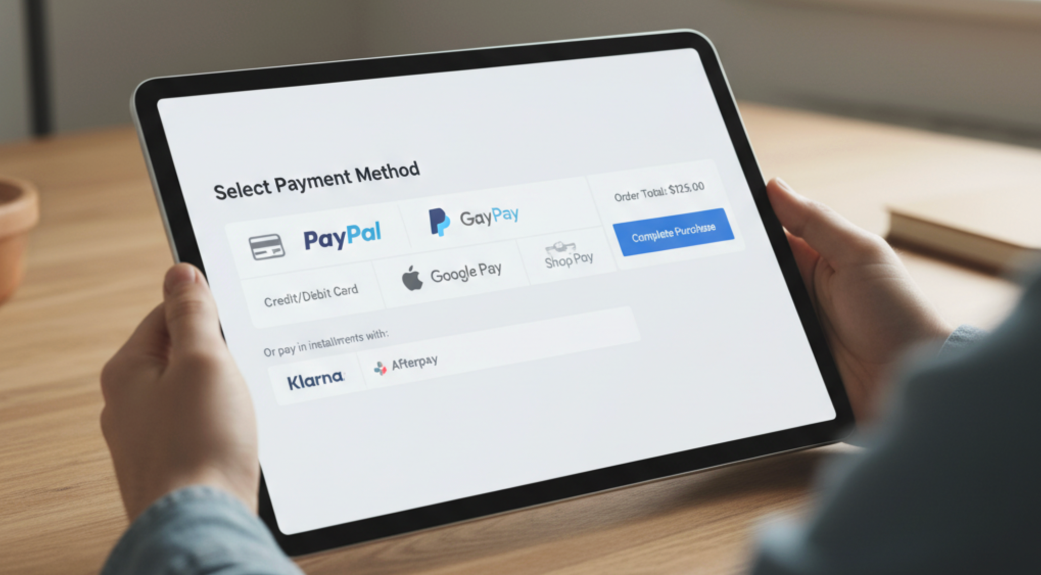
Limiting payment methods makes some buyers hesitate, especially if their preferred option is missing. Offering diverse payment choices signals professionalism and inclusivity.
Providing payment variety assures buyers that you are a serious retailer who understands their needs.
Checkout forms can be tedious, and friction creates doubt. Smart design removes hassle while reinforcing trust.
A faster, easier checkout shows respect for buyers’ time, which builds trust in your brand.
If your checkout page looks drastically different from the rest of your store, buyers may feel suspicious. A consistent, branded experience builds recognition and trust.
Consistency ensures buyers know they are still dealing with your store, not a questionable third party.
Trust increases when customers know they can reach you if something goes wrong.
Accessibility and transparency reduce anxiety, making customers more willing to complete the purchase.
Even at checkout, buyers want reassurance from others who have purchased. Including social proof strengthens confidence.
Integrating social proof ensures buyers don’t feel alone in their decision.
A well-designed checkout page is more than a final step, it’s also a trust-building tool that determines whether buyers complete their purchase or abandon their cart. From simplicity and security to mobile optimization and transparent pricing, every detail signals whether your store is credible.
When shoppers feel reassured, respected, and confident in your checkout process, they are far more likely to finalize their purchase, and come back for more.
In short: good checkout design isn’t just about conversions. It’s about building long-term trust that fuels sustainable eCommerce growth.

