Please select the platform to login


Navigation is one of the most critical elements of any eCommerce website. It directly influences how easily users can find products, discover new items, and complete purchases. Poor navigation can frustrate shoppers, lead to high bounce rates, and ultimately hurt your sales. One of the most common questions among eCommerce designers and store owners is: how deep should navigation go? Finding the right balance between simplicity and comprehensiveness is key. In this article, we’ll explore the ideal navigation depth, factors that influence it, alternatives to deep menus, and best practices to improve usability and conversions.
Navigation depth refers to how many clicks a user must make to reach any given page on your site. Each additional click adds friction to the shopping journey, which can reduce engagement and increase abandonment rates. At the same time, overly shallow navigation can make your menus cluttered and confusing, especially for stores with a wide variety of products. Striking the right balance is essential for providing a smooth user experience.
Impact on user experience:
Every extra click increases the chance of abandonment. Streamline navigation to reduce friction and keep users moving toward conversion.
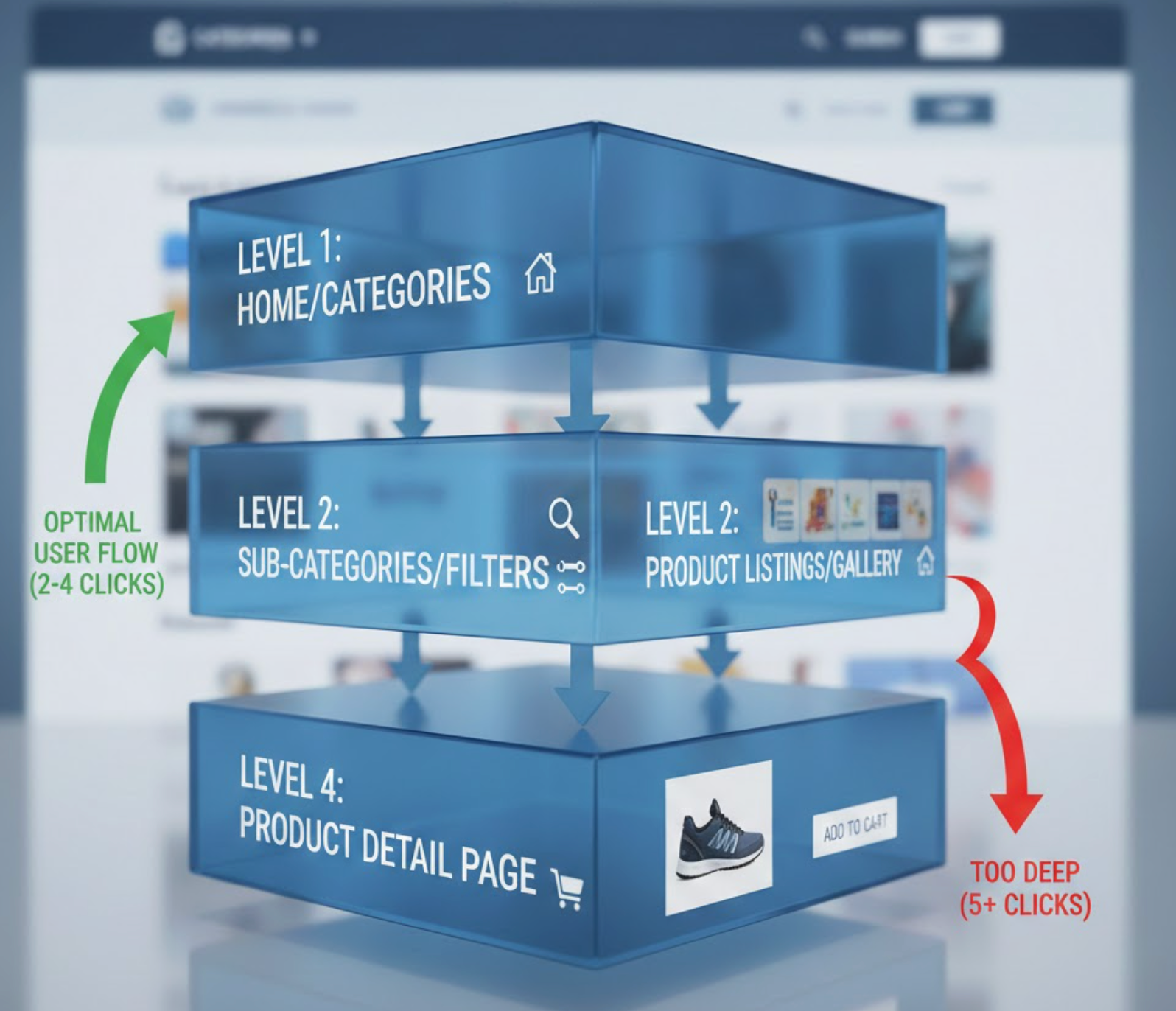
Most usability experts recommend keeping eCommerce navigation 2–3 levels deep. This structure is wide enough to cover your key product categories but shallow enough to avoid confusing users. Here’s how it typically breaks down:
Navigation deeper than three levels can increase friction, especially on mobile devices. Use analytics to determine whether deeper categories are truly needed and ensure users can find products quickly.
Navigation depth isn’t one-size-fits-all. The ideal structure depends on several factors that influence usability, discoverability, and conversion. Understanding these can help you design a navigation system that fits your store and audience perfectly.

If your store has an extensive catalog, deep navigation isn’t your only option. There are several strategies to make finding products easier without increasing click depth:
Combining these solutions ensures users have multiple paths to products, reducing dependency on deep menus and improving overall conversion.
Following best practices ensures your navigation structure is user-friendly, scalable, and conversion-focused. Each recommendation below is explained in detail to help you implement it effectively.
Navigation depth plays a crucial role in eCommerce usability and conversions. Too shallow, and your menus can feel cluttered and overwhelming. Too deep, and users may struggle to find what they want, increasing abandonment. The ideal eCommerce navigation is typically 2–3 levels deep, with clear, understandable labels, supplemented by mega menus, faceted filters, and predictive search when needed. By designing navigation that reduces friction, supports exploration, and aligns with user behavior, you can enhance the shopping experience and boost conversions.
Continuously evaluate your navigation structure using user analytics, testing, and feedback. The goal is to make it intuitive, efficient, and conversion-friendly, regardless of how your product catalog evolves over time.

