Please select the platform to login


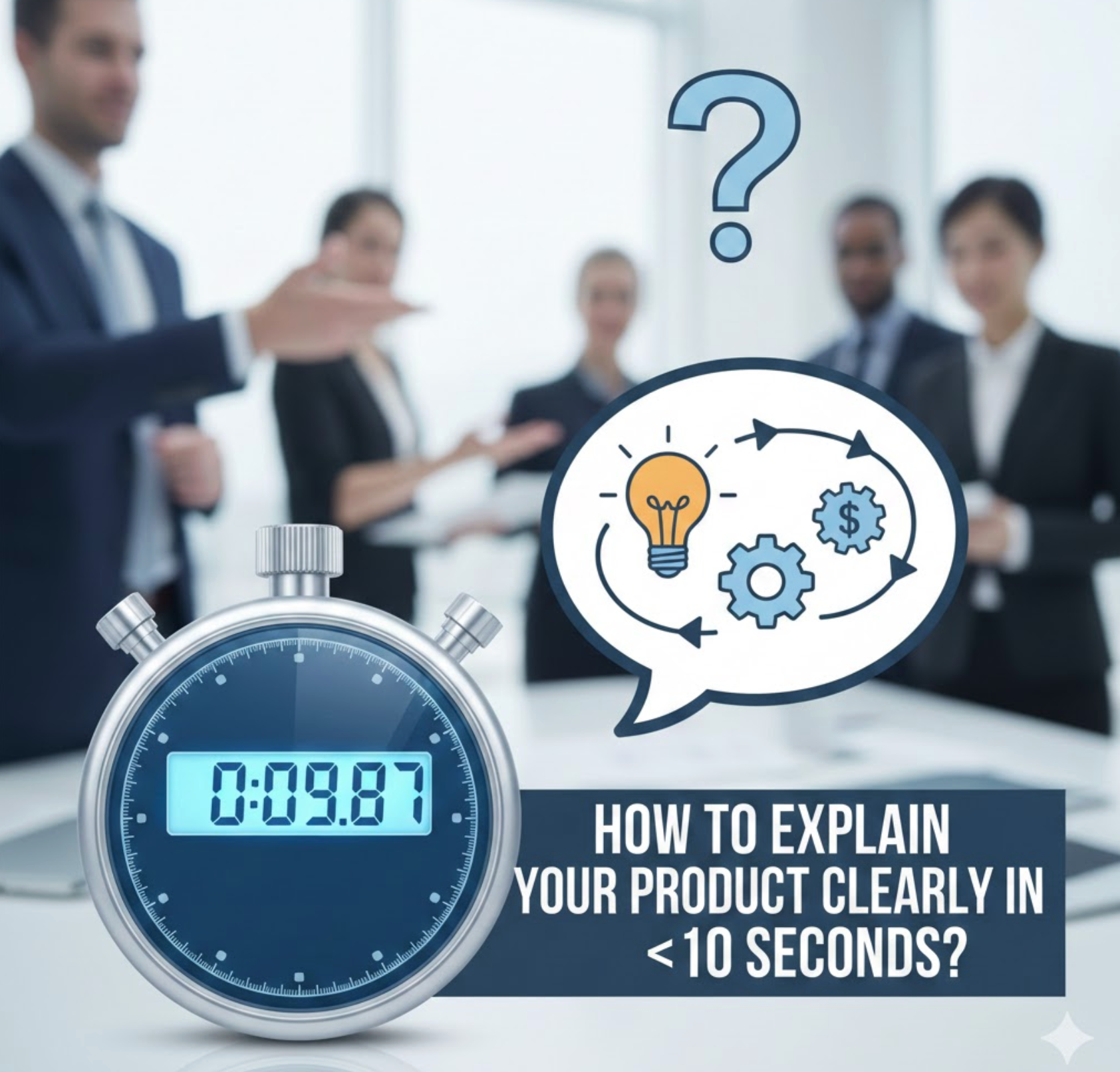
In today’s digital marketplace, attention is the most fragile resource you have. Visitors don’t arrive on your product page ready to study, compare, and analyze, they arrive skimming, distracted, and impatient. Research consistently shows that users decide whether to stay or leave a page in just a few seconds, often before they scroll or click anything meaningful.
That means your product explanation doesn’t have minutes to make an impression. It has seconds. If a visitor cannot quickly understand what your product is, who it’s for, and why it matters, they will simply move on, no matter how good the product actually is. Clarity, not creativity, becomes your most powerful conversion lever.
This article will walk you through how to explain your product clearly in under 10 seconds, why this matters so much for conversions, and how to apply practical frameworks to product pages, landing pages, and ads.
Modern buyers are overloaded with choices. They browse multiple tabs, compare alternatives rapidly, and rely heavily on first impressions to filter options. In this environment, clarity acts as a shortcut for decision-making.
When users land on your page, their brain immediately asks three subconscious questions:
If your page fails to answer these questions almost instantly, cognitive friction kicks in. The visitor feels confused, uncertain, or mentally tired and leaving becomes the easiest option. This is why many high-traffic stores still struggle with low conversion rates: traffic arrives, but clarity doesn’t.
Explaining your product clearly within 10 seconds doesn’t mean oversimplifying or dumbing it down. It means prioritizing understanding before persuasion. Once users “get it,” they are far more open to features, benefits, testimonials, and pricing.
The fastest way to communicate clarity is through a strong, focused value proposition. This is usually the first headline users see, and it should do the heavy lifting.
A good value proposition answers three things in one sentence:
For example:
Notice that the second version removes ambiguity. Users don’t need to guess what problem it solves or whether it applies to them. Within seconds, they can decide if they should keep reading.
Avoid clever wordplay, metaphors, or internal jargon in this sentence. Your goal is instant comprehension, not brand poetry. Creativity can come later, clarity must come first.
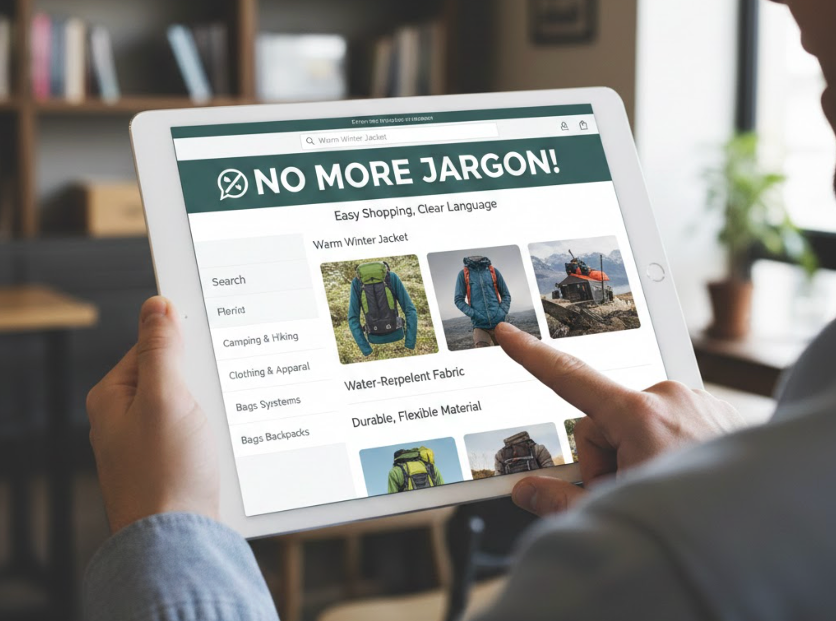
One of the most common reasons products fail to communicate quickly is the use of internal or technical language. Teams know their product deeply, so they unconsciously speak the way they talk in meetings, not the way customers think.
Phrases like “end-to-end solution,” “AI-powered ecosystem,” or “next-generation platform” sound impressive but explain nothing. They force users to interpret meaning rather than immediately understand value.
To fix this, shift your language from how it works to what it helps users do. Customers don’t care about architecture or frameworks in the first 10 seconds. They care about outcomes.
Instead of:
Try:
Plain language reduces cognitive load. When users don’t have to decode your message, they feel more confident, more in control, and more likely to continue.
Another effective way to achieve instant clarity is to anchor your explanation in a problem the user already recognizes. When users see their own frustration reflected on the page, understanding happens almost automatically.
For example:
This approach works because it bypasses explanation entirely. Users don’t need to understand your product yet, they understand the problem, and your product becomes the implied solution.
Once the problem is clear, introduce your product as the answer in simple terms. This sequence mirrors natural human thinking: problem first, solution second. It also helps users quickly self-qualify whether your product is relevant to them.
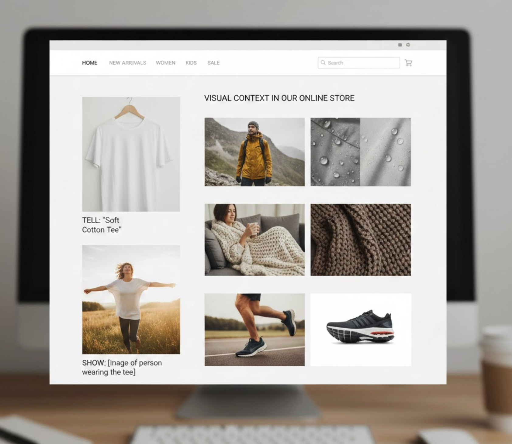
Text alone often isn’t enough to communicate quickly. Visuals can compress understanding into seconds, sometimes faster than words ever could.
A simple product screenshot, short animation, or annotated image can instantly answer questions like:
For eCommerce stores, lifestyle images showing the product in use are far more effective than isolated product shots. For SaaS, a clean interface preview with a clear focal point helps users immediately grasp function and purpose.
The key is relevance. Decorative visuals slow understanding, while functional visuals accelerate it. Every image above the fold should make the product clearer, not prettier.
Your main headline grabs attention and delivers the core message, but your subheadline does important supporting work. It expands on the promise, adds context, or removes doubt, all without overwhelming the reader.
A strong subheadline might:
For example:
Together, these two lines explain the product clearly in seconds. Users don’t need to scroll, click, or think hard to understand the value.
Many product pages fail because they try to explain too much too soon. Teams want to mention every feature, use case, and advantage right away, but this overwhelms users instead of helping them.
In the first 10 seconds, focus on one primary benefit, the main reason someone would choose your product. Secondary benefits can come later as users scroll and explore.
Think of this like a conversation. You wouldn’t introduce yourself by listing everything you’ve ever done. You’d start with the most relevant detail. Your product explanation should work the same way.
When users understand the core benefit quickly, they are more willing to invest time learning the rest.
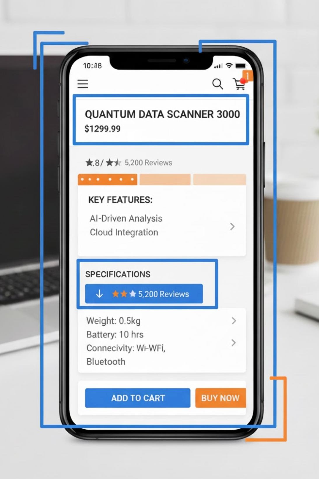
Most users don’t read word by word, they scan. This means clarity depends not only on what you say, but how it’s structured.
To make the product information easy for scanning, you should use:
Avoid large blocks of text above the fold. Even if the content is good, dense formatting slows comprehension. Visual hierarchy guides the eye and helps users assemble meaning quickly.
Well-structured content allows users to understand your product almost passively, without effort.
The most dangerous assumption is thinking your explanation is clear because you understand it. The only way to know if your product can be explained in under 10 seconds is to test it with real people.
A simple test:
If they struggle, hesitate, or guess incorrectly, clarity is missing. This feedback is far more valuable than internal opinions or copy debates.
Iterate based on confusion, not compliments. The goal isn’t to impress, it’s to be understood.
Even strong products often fail to communicate clearly because of a few predictable mistakes. These issues usually come from teams being too close to their own product and forgetting how little context first-time visitors have. When clarity is missing, users hesitate, and hesitation quickly turns into exits.
Each of these adds friction. In a 10-second window, friction is fatal, simplicity, focus, and relevance always win.
Explaining your product clearly in under 10 seconds isn’t just a copywriting exercise, it’s a strategic advantage. Clarity reduces bounce rates, increases engagement, improves ad performance, and builds trust before persuasion even begins.
The best products don’t force users to work to understand them. They meet users where they are, speak in familiar language, and guide understanding effortlessly. When users “get it” fast, everything else, features, proof, pricing, works better.
If you want higher conversions, better retention, and stronger brand trust, start here. Make clarity your first promise, and deliver it in seconds.

