Please select the platform to login


Featuring products is one of the most effective ways to influence how customers browse your store, discover items, and ultimately make purchasing decisions. However, striking the right balance between visibility and simplicity is often more difficult than it seems. If your store highlights too many products at once or presents them in a cluttered, unstructured layout, customers can quickly feel confused or pressured. This often leads to decision fatigue, causing shoppers to bounce before they explore further.
In today's online shopping environment, where customers expect speed, clarity, and ease of navigation, it becomes even more essential to curate product displays thoughtfully. A well-featured set of products should act like a guide, offering direction, sparking interest, and leading customers deeper into your catalog without overwhelming them with choices.
In this expanded guide, we’ll walk through detailed, practical strategies to help you feature products effectively, ensuring your store looks clean, focused, and engaging.
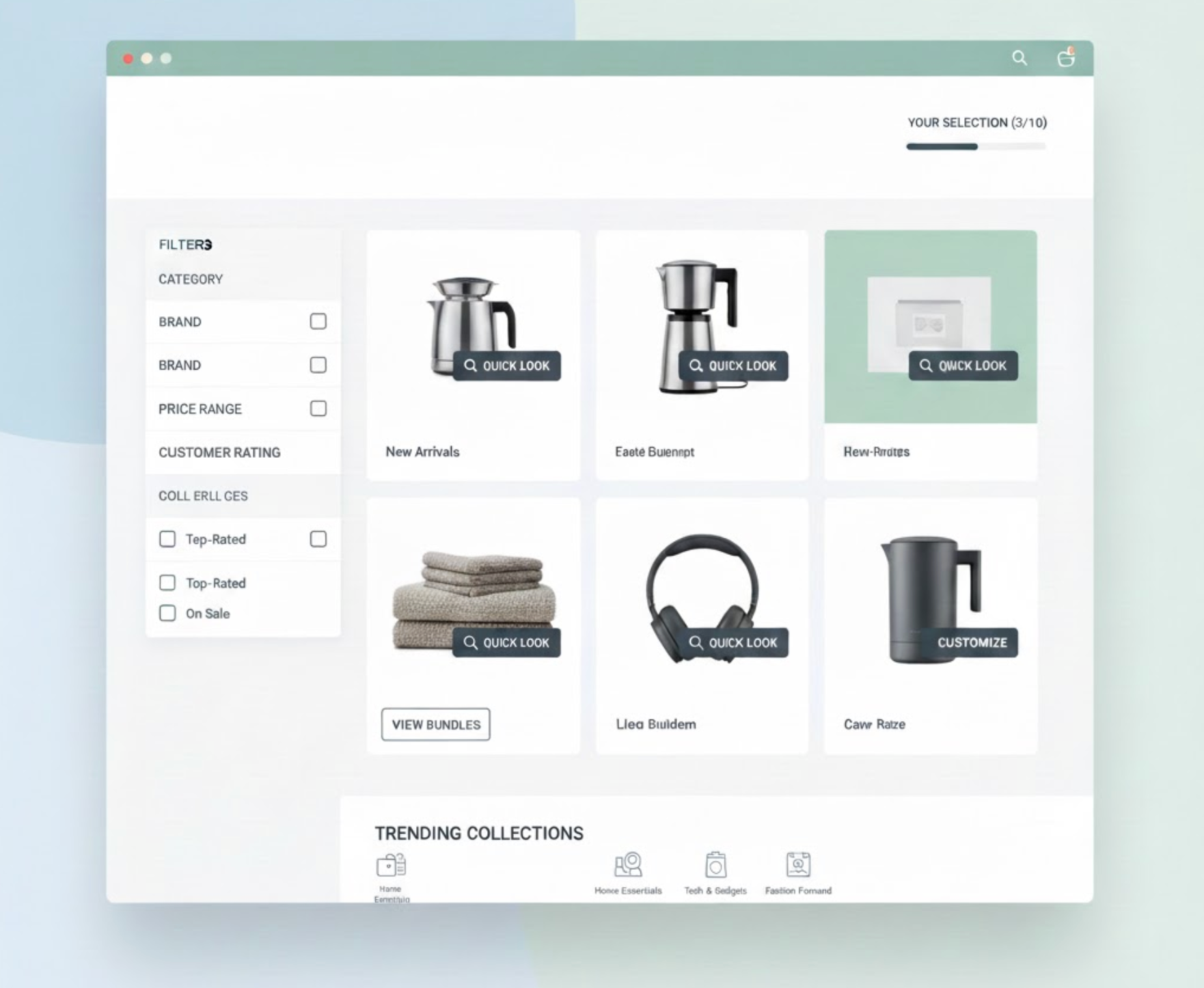
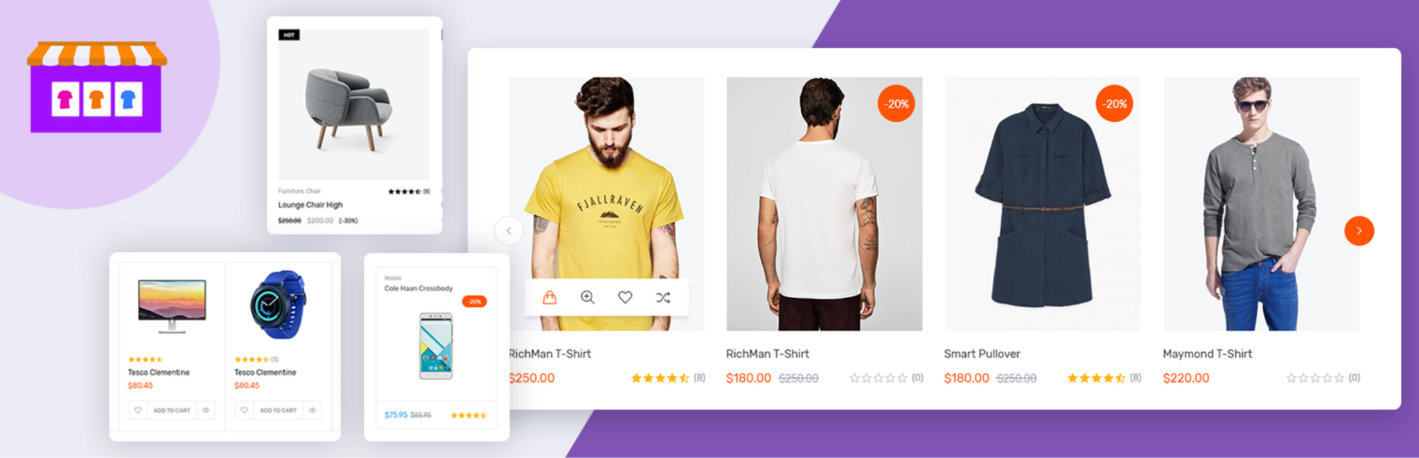
The first step in preventing overwhelm is deciding which products truly deserve the spotlight. Instead of featuring everything at once, narrow your focus to the items that are most meaningful to your customers or most strategic for your business, such as best sellers, customer favorites, new arrivals, or high-margin products. When you limit the number of featured products to a curated 3–6 items, you create a clear point of attention that customers can understand within seconds.
This approach increases engagement because customers are less likely to feel overloaded when confronted with fewer choices. It also gives each product more space to shine, boosting visibility and the likelihood of conversions. By thoughtfully selecting which items appear first, you set the tone for the rest of the browsing experience and guide customers toward exploring your store with confidence.
Visual hierarchy is a powerful design principle that helps customers instinctively understand where to look first. By using larger images, bolder typography, or contrasting colors for your most important products, you can direct attention naturally without overwhelming the layout. You don’t have to tell your customers what to look at, your design does the work for you.
Elements such as spacing, alignment, and consistent card design also play a role in creating an organized, easy-to-scan page. When customers feel that the interface is predictable and well structured, they relax and explore more comfortably. With clear visual hierarchy, you ensure that the most important products stand out while maintaining a harmonious, uncluttered look across your store.
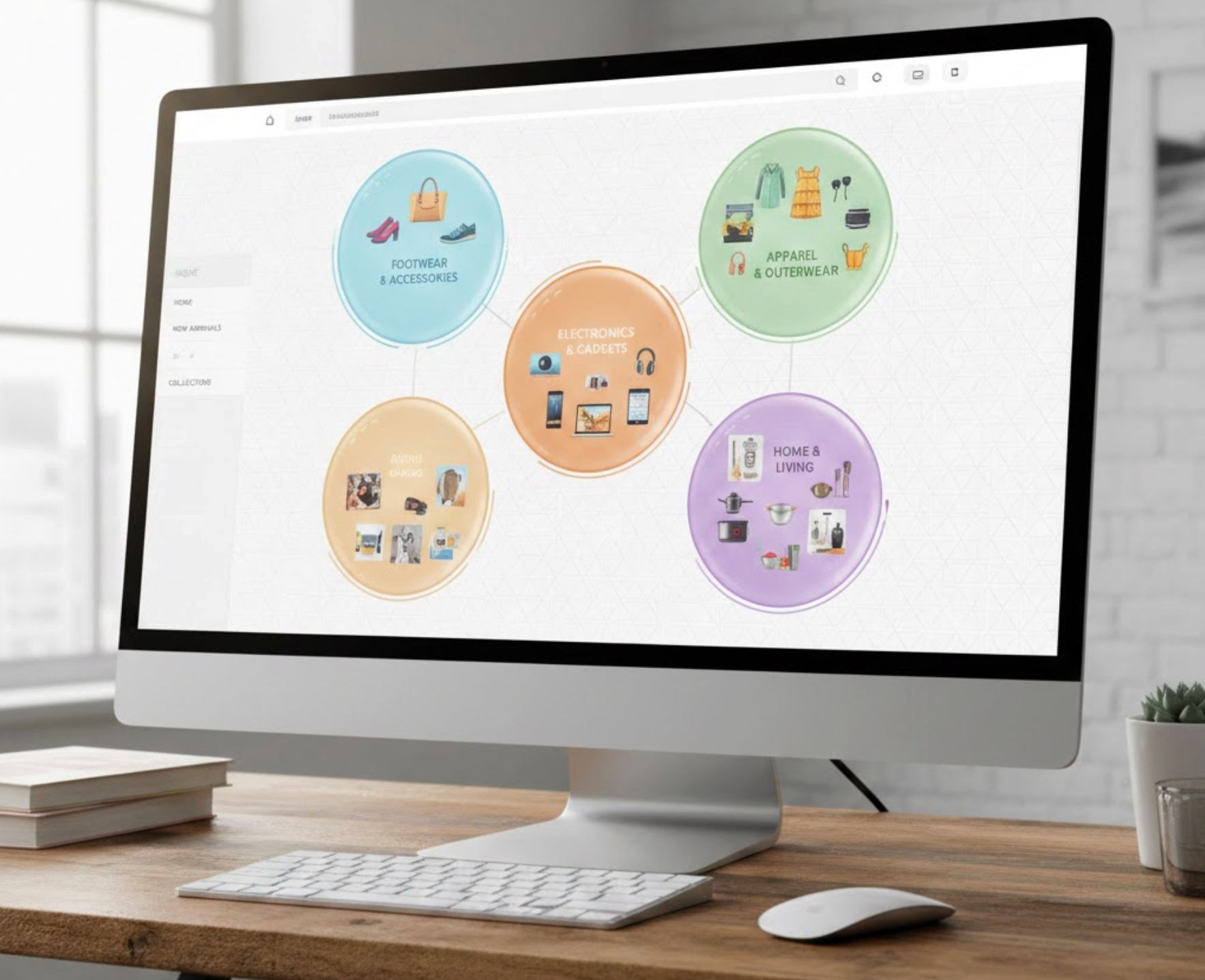
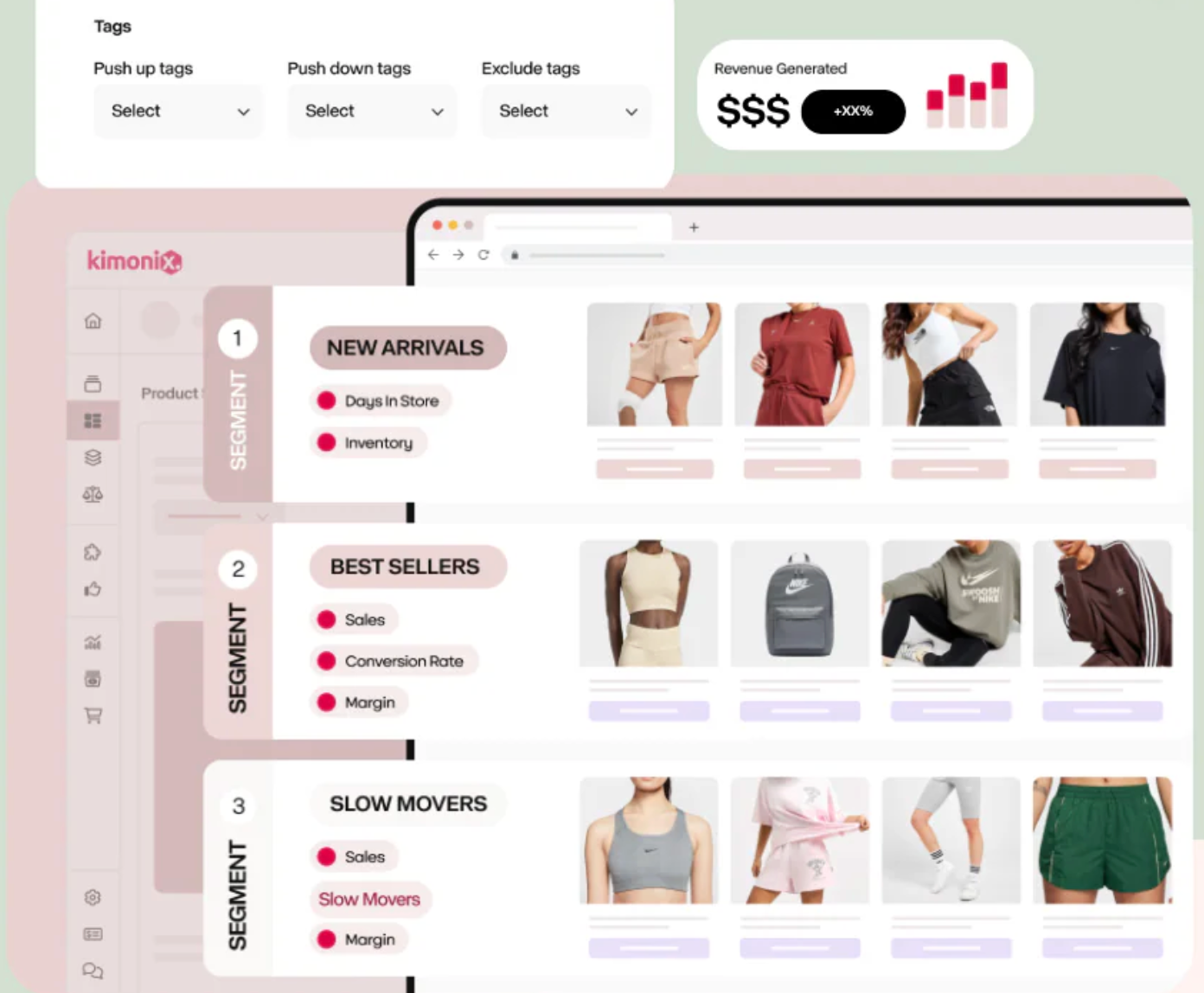
One of the easiest ways to simplify product discovery is by grouping items into logical collections. Whether you organize them by category, seasonal theme, style, or customer need, collections give structure to your store and help customers understand how items relate to each other. The alternative, random, scattered product highlights, can quickly cause confusion and visual chaos.
Collections break the browsing experience into digestible sections, allowing customers to explore one group at a time rather than being hit with everything at once. This reduces cognitive load and makes shopping feel more intentional. By offering clear pathways such as “For Summer,” “Most-Loved Items,” or “Under $50 Picks,” you gently guide shoppers through your store in a meaningful, manageable way.
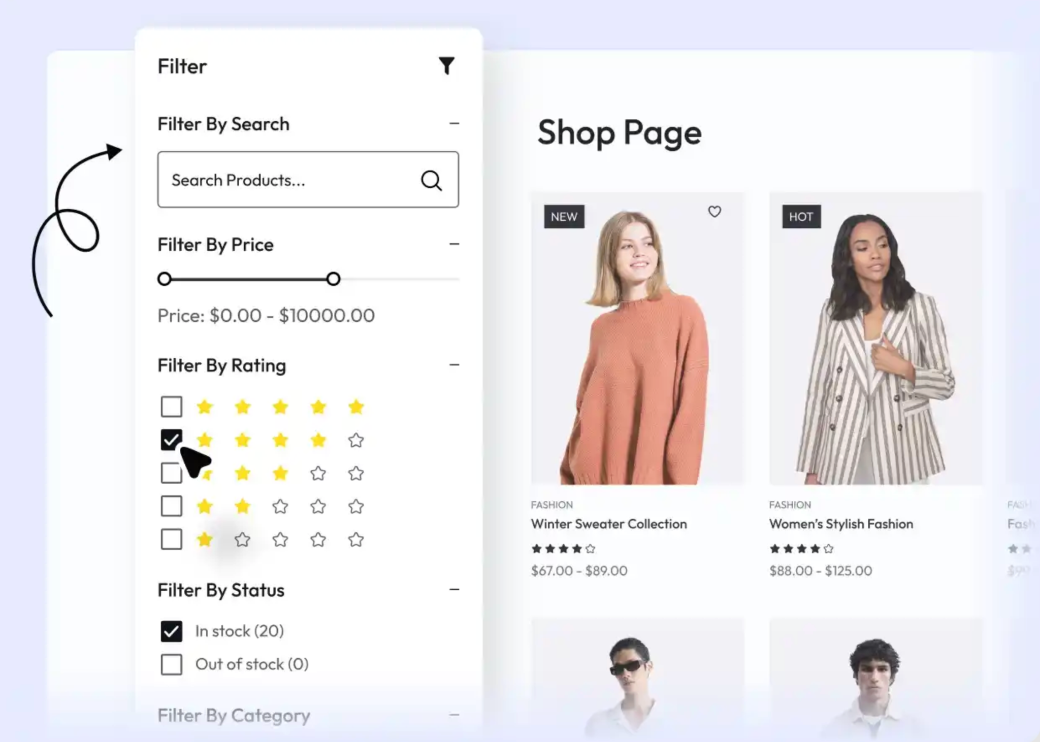
Even when products are featured strategically, customers may still want more control over how they browse. Filters and sorting tools empower them to quickly narrow down results based on what matters most, such as size, color, price, material, purpose, or customer ratings. Without these tools, customers may feel stuck scrolling endlessly, increasing frustration.
Smart search helps reduce perceived clutter by letting shoppers hide everything that isn’t relevant. Sorting options like “Best-Selling,” “Newest,” or “Recommended for You” enhance this experience by helping customers view products in a more personalized order. When shoppers feel in control of their browsing journey, they stay longer and make decisions more confidently.
Relevant recommendations can enhance the customer experience, but too many suggestions can do the opposite. Instead of displaying long lists of related items or upsells, limit recommendations to 3–5 highly relevant products. Personalize these suggestions by pulling from browsing history, wishlists, or items frequently bought together.
This makes the recommendations feel more like helpful assistance rather than aggressive sales tactics. Customers are far more likely to explore a small group of carefully selected items than a giant grid of unrelated ones. By showing fewer but more relevant recommendations, you guide customers toward meaningful discovery without adding unnecessary mental load.
Progressive disclosure is a design approach where you show essential information first and reveal additional details only when customers ask for them. This helps keep the initial view clean, straightforward, and less overwhelming, especially if your products have many variations or technical specifications.
For example, instead of displaying the full product description or every color variation upfront, you might show a short summary with an option to expand for more. This allows customers to access deeper information only when they’re ready, while preserving a minimalist, easy-to-navigate interface.
Sometimes overwhelming customers happen not because of the number of products displayed, but the timing. Featuring products in the wrong place or at the wrong moment, such as showing upsells before the customer even decides on their main item, can feel intrusive.
Instead, use contextual placement. Display recommendations right after a customer engages with a related product, scrolls to a certain point, or adds something to the cart. This approach feels more natural and aligned with customer behavior. When timing is right, featured products feel supportive rather than pushy, helping customers move through the shopping journey smoothly.
Even a small number of products can feel overwhelming if the design itself is cluttered. This makes clean, modern design essential. Ample white space, simple typography, balanced layouts, and consistent product cards all work together to create a visually calm environment.
Minimal design means avoiding distraction. By stripping away unnecessary elements and focusing on clarity, you let the featured products speak for themselves. A clean visual presentation helps customers process information quickly and reduces confusion, making it easier for them to browse confidently.
Carousels are a great way to showcase multiple featured items without consuming too much space, but they must be used with intention. Overloading a carousel with too many slides or setting it to auto-scroll too quickly can overwhelm customers and cause them to ignore it entirely.
Instead, keep your carousel between 5–8 slides and allow manual navigation. Highlight only your most important products or collections. A well-organized carousel can enhance discoverability while still maintaining a clean, uncluttered page layout.
Data-driven optimization is a powerful way to refine how you feature products. Metrics such as click-through rate, time spent on product cards, add-to-cart frequency, and scroll behavior reveal which items resonate with your audience and which do not.
By analyzing this data regularly, you can rotate weak performers out of your featured sections and replace them with items that generate stronger engagement. This keeps your store fresh, relevant, and aligned with customer interests. Data takes the guesswork out of product placement, ensuring customers see items that genuinely match their preferences.
Featuring products is more than just placing items at the top of your homepage or collection page, but it’s a strategic approach that influences how customers think, feel, and shop. When done thoughtfully, featuring products provides direction, reduces cognitive load, and improves overall navigation. Customers appreciate a curated experience that helps them find what they want quickly without feeling overwhelmed by endless choices.
By focusing on clear priorities, leveraging strong visual hierarchy, organizing items into intuitive collections, and maintaining a clean, minimal layout, you give customers a smoother, more enjoyable shopping journey. When customers feel supported rather than pressured, they’re more likely to browse further, trust your store, and complete a purchase.
A well-designed product-feature strategy not only boosts conversions but also builds long-term customer satisfaction and loyalty.

