Please select the platform to login


Your product category pages are the unsung heroes of your eCommerce store. They guide visitors from curiosity to conversion, helping them browse, compare, and select products with ease. A strategic layout not only enhances visual appeal but also directly impacts user experience (UX), engagement, and ultimately, sales. Choosing the right layout is about understanding how your customers shop, whether they love scanning visuals, reading details, or filtering by preferences.
In this article, we’ll explore 10 proven category page layouts that consistently deliver better usability, higher engagement, and increased conversions for online stores of all types.

The grid layout is one of the most commonly used formats in online retail. It displays multiple products in neat rows and columns, usually 3–5 items per row. This layout works best for brands that rely on strong visuals, such as clothing, furniture, or beauty products. It provides a clear, organized look that helps customers compare options instantly.
Why it works: The symmetrical design makes scanning easy, allowing shoppers to view many products simultaneously. It also emphasizes product imagery, which plays a crucial role in impulse buying.
Best practices for Grid Layout:

The list layout presents products vertically, each with a large image and detailed description beside or below it. This structure caters to customers who prefer reading about features, specifications, or benefits before making a purchase. It’s particularly effective for categories like electronics, software, or health supplements.
Why it works: The layout supports richer content presentation, product details, ratings, stock status, and CTAs all fit comfortably.
Best practices for List Layout:
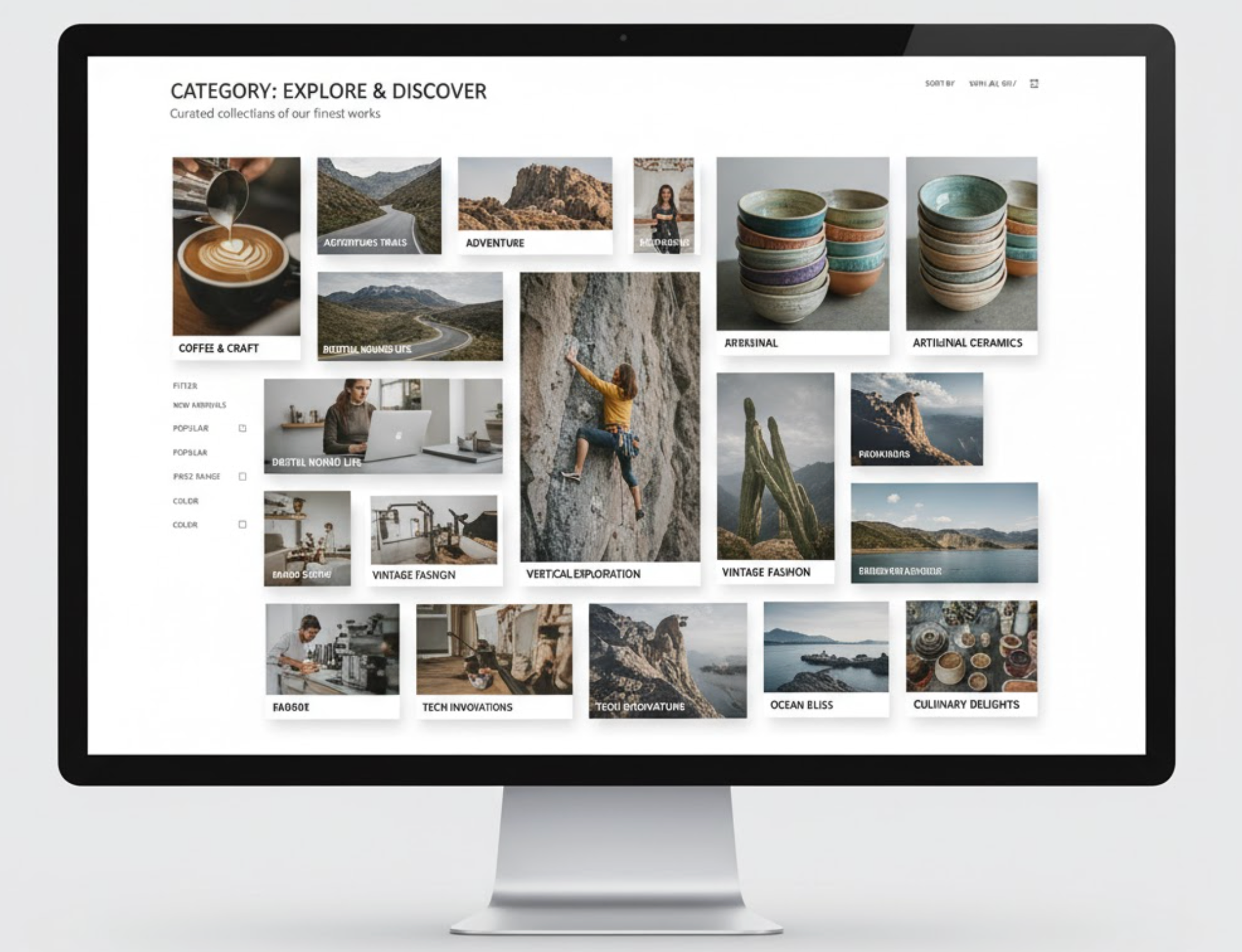
Inspired by Pinterest boards, the masonry layout arranges products in an asymmetric grid where image heights vary. It creates a visually dynamic page that feels fresh and modern. This design is popular among lifestyle, handmade, and art stores, where aesthetic presentation matters as much as the product itself.
Why it works: The staggered design captures attention and encourages exploration, shoppers tend to scroll longer through visually diverse layouts.
Best practices for Masonry Layout:
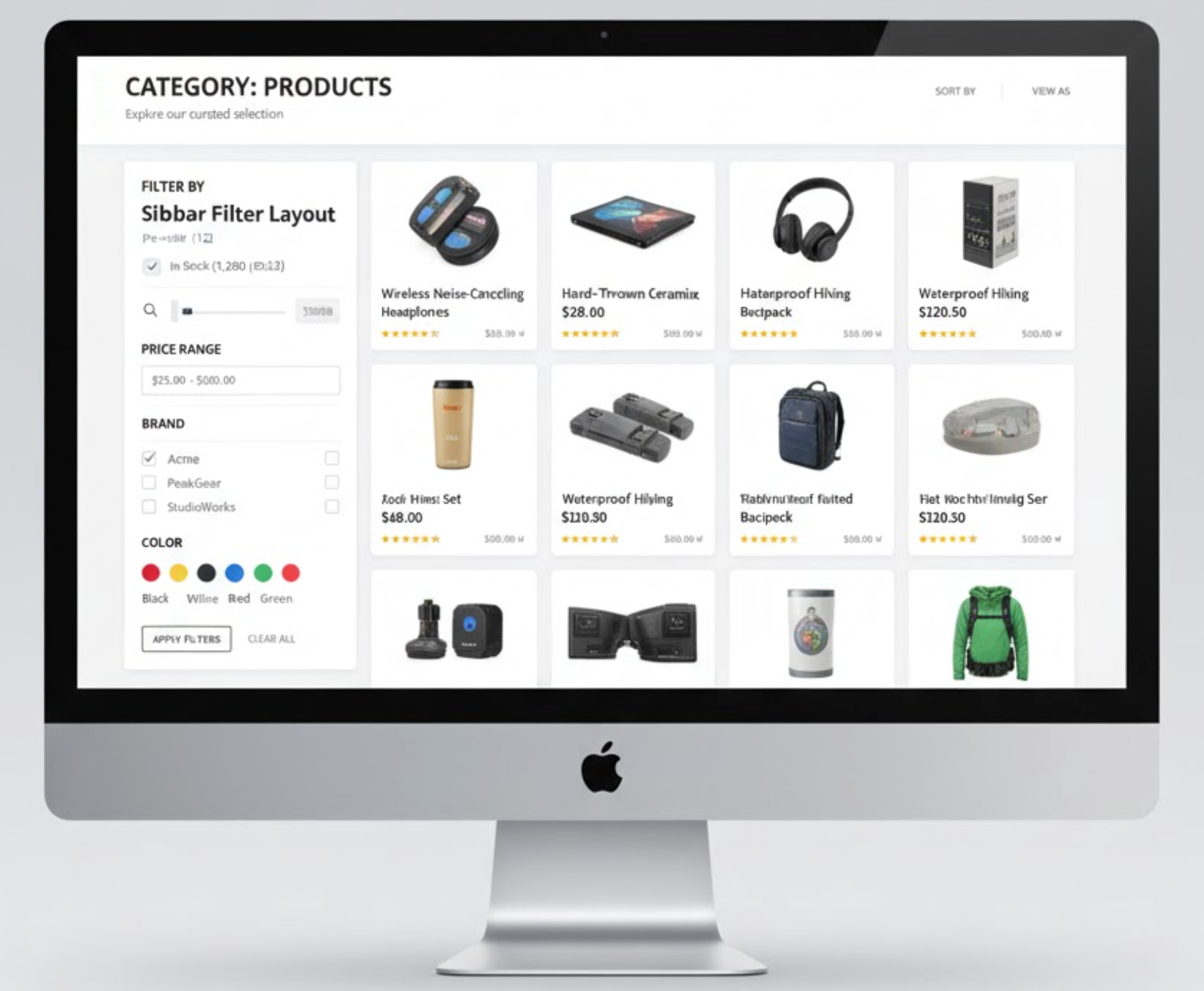
The sidebar filter layout integrates advanced filtering options, often positioned on the left side of the screen. Customers can narrow their search by price, color, size, rating, or brand, improving product discovery. It’s essential for stores with large inventories, such as electronics, apparel, or marketplace-style sites.
Why it works: It gives customers control over their shopping experience, reducing frustration and time spent searching.
Best practices for Sidebar Filter Layout:

This layout uses the entire screen width to display large, high-quality images and minimal text, creating a bold and immersive experience. Premium or fashion brands often use this design to highlight their visual storytelling.
Why it works: It evokes emotion and captures brand identity while showcasing product craftsmanship.
Best practices for Full-Width Visual Layout:

The minimalist layout focuses on simplicity, neutral colors, limited text, and generous whitespace, to make the products stand out naturally. It’s ideal for niche, design-conscious, or luxury brands that rely on elegance and clarity.
Why it works: It eliminates distractions and keeps users focused solely on the products, fostering a premium perception.
Best practices for Minimalist Layout:

This layout combines a large hero banner or slideshow at the top with featured products displayed below. It’s commonly used for campaigns, seasonal sales, or themed collections. The banner helps tell a story or convey a promotion instantly.
Why it works: It blends visual storytelling with immediate product access, encouraging exploration and boosting conversion rates for promoted collections.
Best practices for Product Highlight + Banner Layout:

Infinite scrolling dynamically loads more products as users move down the page, removing the need for pagination. This layout keeps users engaged longer, reducing the risk of abandonment mid-browse. It’s particularly effective for fashion, accessories, or general marketplaces with large inventories.
Why it works: It creates a seamless browsing journey without breaks, perfect for mobile users who prefer scrolling over clicking.
Best practices for Infinite Scroll Layout:

The split-view layout divides the screen into two functional sections, one side for filters or category details and the other for product listings. It offers a modern look and enhances discoverability without overwhelming users. This format works well for home décor, B2B, or niche markets where filtering options need constant visibility.
Why it works: It combines clarity with functionality, allowing users to refine searches without losing sight of the results.
Best practices for Split-View Layout:
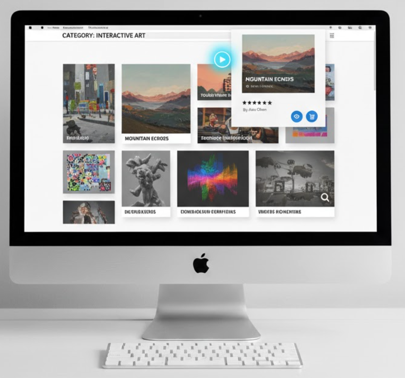
The interactive gallery layout incorporates motion and interactivity, such as hover videos, quick previews, or AR product try-ons. It’s an advanced layout that appeals to tech-savvy or visually-driven audiences.
Why it works: It transforms static browsing into an engaging, immersive experience that increases session duration and conversion rates.
Best practices for Interactive Gallery Layout:
Your product category page layout can make or break your customer’s browsing experience. The best layout aligns with your brand personality, product type, and target audience behavior. Whether you favor a minimalist approach to convey luxury, a grid system for simplicity, or an interactive gallery for engagement, consistency and usability remain key.
Regularly analyze user behavior using heatmaps or A/B testing, and session recordings to determine what works best. Remember, your goal isn’t just to showcase products but to make discovery effortless, enjoyable, and conversion-driven. With the right layout strategy, every category page can become a powerful sales engine for your eCommerce store.

