Please select the platform to login


In today’s competitive ecommerce landscape, a beautiful Shopify store alone is not enough to guarantee sales. Every interaction a visitor has with your store, from landing on the homepage to completing a purchase, contributes to their overall experience and perception of your brand. User experience, or UX, is the art and science of designing this journey to be intuitive, seamless, and enjoyable. A store with excellent UX not only encourages customers to explore products but also builds trust, reduces friction, and increases the likelihood of conversions.
This ultimate Shopify UX checklist is designed to guide store owners through every critical aspect of the shopping experience. From homepage design and navigation to product pages, checkout flow, mobile optimization, and post-purchase engagement, this guide provides practical tips and actionable strategies to help you create a high-converting, user-friendly store. By following these best practices, you can improve customer satisfaction, boost sales, and establish a strong, professional brand presence.
The homepage is the first point of contact for many visitors. It sets the tone for your brand and influences whether users continue browsing. Think of it as a digital storefront—your goal is to grab attention, provide clarity, and guide users seamlessly to explore further.
A strong value proposition answers the visitor’s most important question: “Why should I shop here?”
By clearly stating your value upfront, you reduce confusion and encourage users to engage with your store. Once visitors understand what makes your store unique, they’re more likely to continue exploring.
A visually balanced homepage not only captures attention but also enhances comprehension, making it easier for users to understand your offerings and take action.
Navigation and search are closely linked; when both are intuitive, users spend less time searching and more time engaging with products, creating a smoother shopping experience.
Every CTA is an opportunity to lead users toward conversion. By placing them thoughtfully, you make the path to purchase clearer and more compelling.
Speed is not just a technical detail, but it directly influences user perception and satisfaction. A fast-loading homepage signals professionalism and reliability, encouraging visitors to explore further.
Once users engage with your homepage, the next critical factor is navigation. Clear and intuitive site structure ensures visitors can find what they need quickly, reducing frustration and increasing conversion.
A well-structured simple menu sets the stage for an effortless browsing experience. When combined with other UX improvements, it reduces friction throughout the site.
By maintaining a sticky header, you create a continuous pathway for users to explore without getting lost or frustrated.
Breadcrumbs act as a safety net; they provide context and reduce anxiety by reminding users of their location within the store.
A robust search function complements navigation, helping users find what they want even if they don’t follow the menu path. Together, these elements create a cohesive browsing experience.
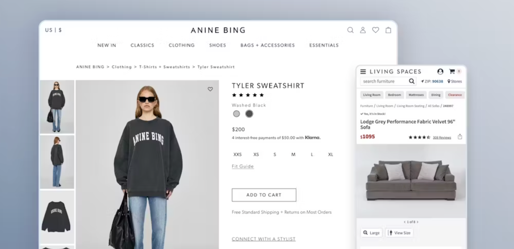
Product pages are where intent turns into action. Each page should reduce hesitation, answer questions, and inspire confidence in the buyer.
Visual clarity reduces uncertainty and enhances user satisfaction, which directly impacts conversion rates.
Transparent pricing eliminates surprises at checkout, reducing cart abandonment.
A detailed product description reassures users, answers potential objections, and builds confidence in their purchase.
Social proof helps new visitors feel more comfortable buying, bridging the gap between curiosity and purchase.
Trust elements are critical at this stage; they reduce perceived risk and reinforce the credibility established on the homepage.
A prominent CTA guides users from consideration to action seamlessly, reducing friction in the purchase journey.
Recommendations create a fluid shopping experience, encouraging exploration and maximizing the value of each visit.
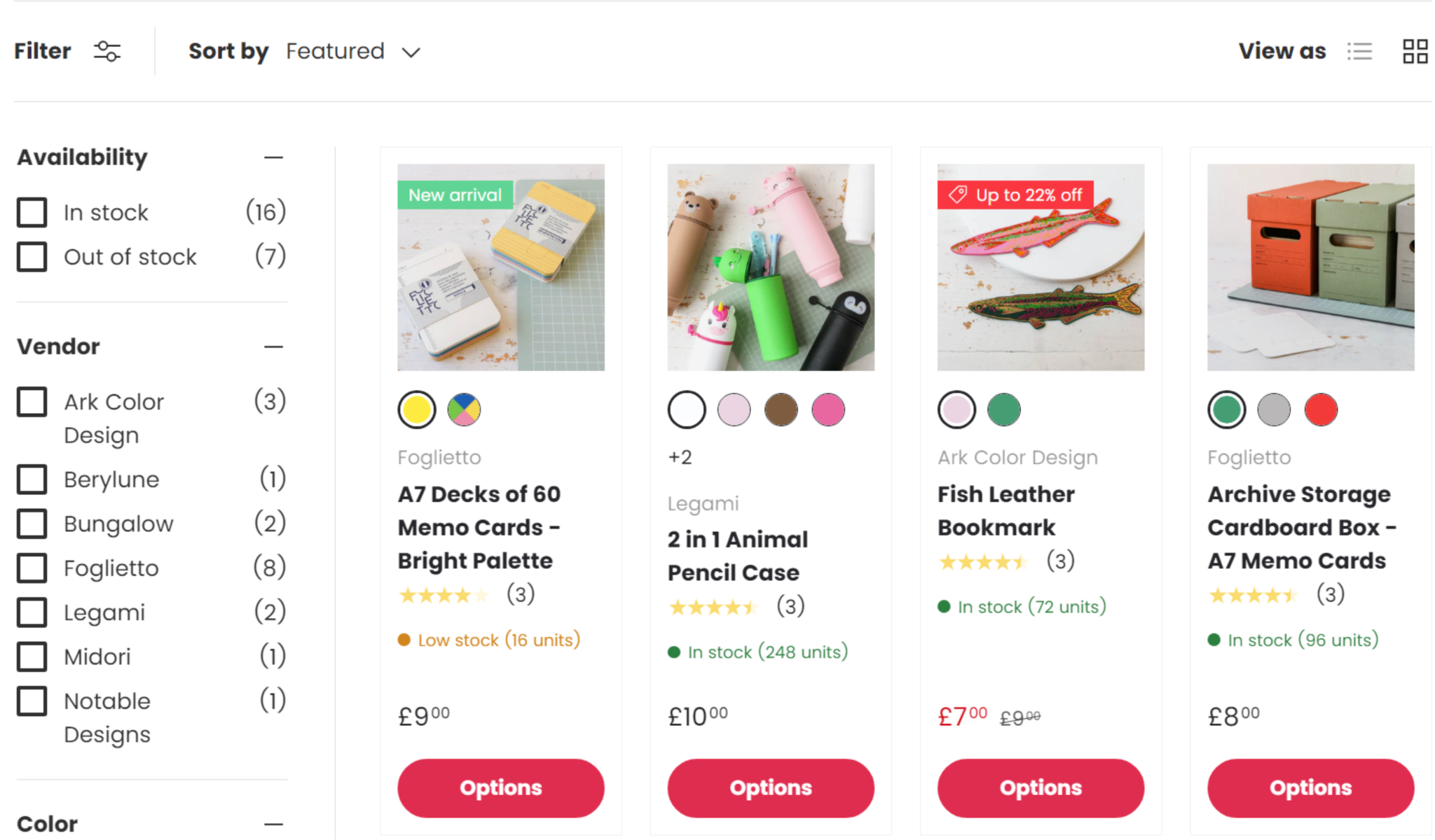
Collection pages play a critical role in helping users browse multiple products efficiently. While the homepage introduces your brand, collection pages organize your products logically, making it easier for shoppers to find what they want and discover new items along the way. Good UX on these pages reduces friction, keeps users engaged, and encourages longer browsing sessions.
A clean layout not only makes the page aesthetically pleasing but also allows users to compare multiple products quickly, helping them make confident purchase decisions.
Filters and sorting tools help users narrow down choices efficiently, reducing frustration and improving overall satisfaction. When these features are well-designed, shoppers are more likely to stay on your site and continue browsing.
This reduces unnecessary page loads and keeps users engaged, making the shopping process smoother and faster.
By using consistent labels, you make browsing intuitive and allow users to focus on products that match their needs or interests.
The cart and checkout stage is one of the most crucial parts of the shopping journey. Even small friction points, unclear pricing, or complicated forms can result in abandoned carts. Optimizing these pages ensures that your users can complete their purchase effortlessly.
Persistent carts prevent frustration and make it easy for returning visitors to continue shopping without starting over.
This feature improves usability by giving shoppers an overview of their selected items while keeping them engaged with product browsing.
Unexpected costs are a leading cause of cart abandonment, so transparency builds trust and increases the likelihood of purchase completion.
A simplified checkout reduces cognitive load and speeds up the purchase process, making it more likely that users will complete their transaction.
Trust is essential at this stage because users are sharing sensitive information. Ensuring them that their data and purchase are secure reduces hesitation and boosts conversions.

Mobile commerce dominates online shopping, so a mobile-first UX is essential. Many users will browse and purchase entirely on smartphones, and a poor mobile experience can cost conversions.
A fully responsive store ensures that mobile users have the same smooth, engaging experience as desktop visitors.
Properly sized buttons reduce frustration and make interactions seamless, improving the mobile user experience.
Speed is critical on mobile because it directly affects user satisfaction and retention.
This ensures the purchase option is always accessible, encouraging users to act without hunting for buttons or losing focus.
Site speed affects UX, conversions, and search engine rankings. Slow pages frustrate visitors and decrease trust in your store. Optimizing performance ensures a smooth, enjoyable browsing experience.
Optimized images maintain visual quality while reducing page weight, which improves load times and overall satisfaction.
A faster store feels more professional and encourages users to explore more content and products.
A well-optimized theme ensures smooth animations, responsive layouts, and efficient code execution, all of which improve UX.
By combining these optimizations, you create a store that feels instantaneous, keeps users engaged, and performs well across devices and networks.
Accessibility ensures your store is usable for all customers, including those with disabilities. An accessible store also improves SEO and demonstrates inclusivity, enhancing your brand reputation.
Descriptive links improve both usability and accessibility, helping all users understand the purpose of each link.
Trust and consistent branding are critical for keeping users engaged and encouraging repeat purchases. Clear content reassures users and communicates professionalism.
UX does not end at checkout. Post-purchase experiences influence customer loyalty, repeat sales, and word-of-mouth marketing. A positive post-purchase experience encourages customers to return and refer others.
A well-optimized Shopify UX is the cornerstone of a successful online store. Every aspect, from the homepage to post-purchase follow-up, contributes to the overall experience that visitors have with your brand. By following this detailed checklist, you can create a store that is intuitive, trustworthy, visually appealing, fast, and accessible across all devices. Smooth navigation, clear product information, and transparent policies reduce friction, build trust, and ultimately lead to higher conversions.
Regularly auditing your store and continuously improving its UX will keep you competitive in the evolving ecommerce landscape. Prioritizing user experience is not just about aesthetics, but it is a strategic investment in customer satisfaction, loyalty, and sustainable growth.

