Please select the platform to login


The checkout button may look like a small design element, but it carries a huge responsibility. It’s the final bridge between a shopper’s intent and a completed purchase. Even when your product pages, pricing, and offers are strong, a poorly designed checkout button can quietly undermine conversions.
Effective checkout button design is not about making something flashy, it’s about clarity, confidence, and momentum. When done right, the button gently guides users forward without friction, hesitation, or confusion. Below are the most important best practices to ensure your checkout button works with user psychology, not against it.
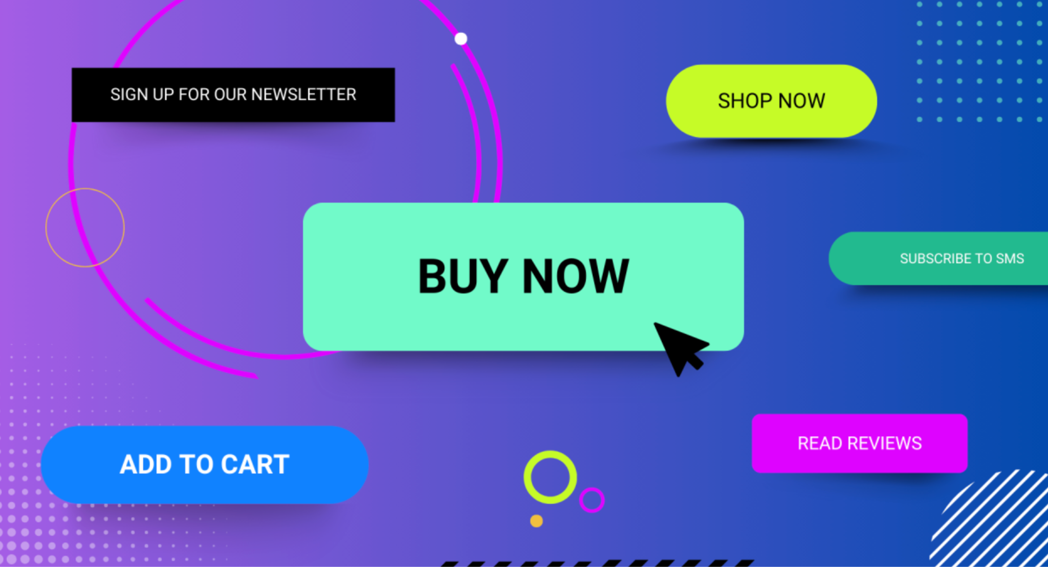
At checkout, users should never have to search for the next step. The primary checkout button must clearly stand out from everything else on the page. If it blends into the background or competes with secondary actions, hesitation increases.
A visually dominant button creates an instant sense of direction. It tells users, “This is what you do next,” without requiring conscious effort. The goal is not to overwhelm the design, but to establish a clear visual hierarchy.
Key considerations include:
When users instinctively notice the checkout button first, they move forward with less friction.
Button text plays a surprisingly powerful role in conversion. Generic labels like “Submit” or “Continue” force users to think, while clear, action-driven copy removes uncertainty.
Your checkout button should describe exactly what will happen next. This builds confidence and reduces the fear of accidental commitment, especially for first-time buyers.
Effective button copy typically:
When users understand the action behind the click, they’re far more likely to follow through.
The area surrounding the checkout button is just as important as the button itself. Too much text, clutter, or competing options nearby can create decision fatigue at the worst possible moment.
A clean, focused layout helps users stay in “completion mode.” The fewer distractions they face, the more likely they are to finish the purchase.
To reduce cognitive load, you need to:
By simplifying the environment, you allow the button to do its job without resistance.
On mobile devices, the checkout button becomes even more critical. Smaller screens, touch interactions, and on-the-go users demand precision and ease. A button that works well on desktop may fail entirely on mobile if not optimized properly.
Mobile-friendly checkout buttons should feel effortless to tap and impossible to miss. Any friction here can quickly lead to abandonment.
Best practices for mobile include:
A mobile-optimized checkout button respects how users actually hold and interact with their devices.
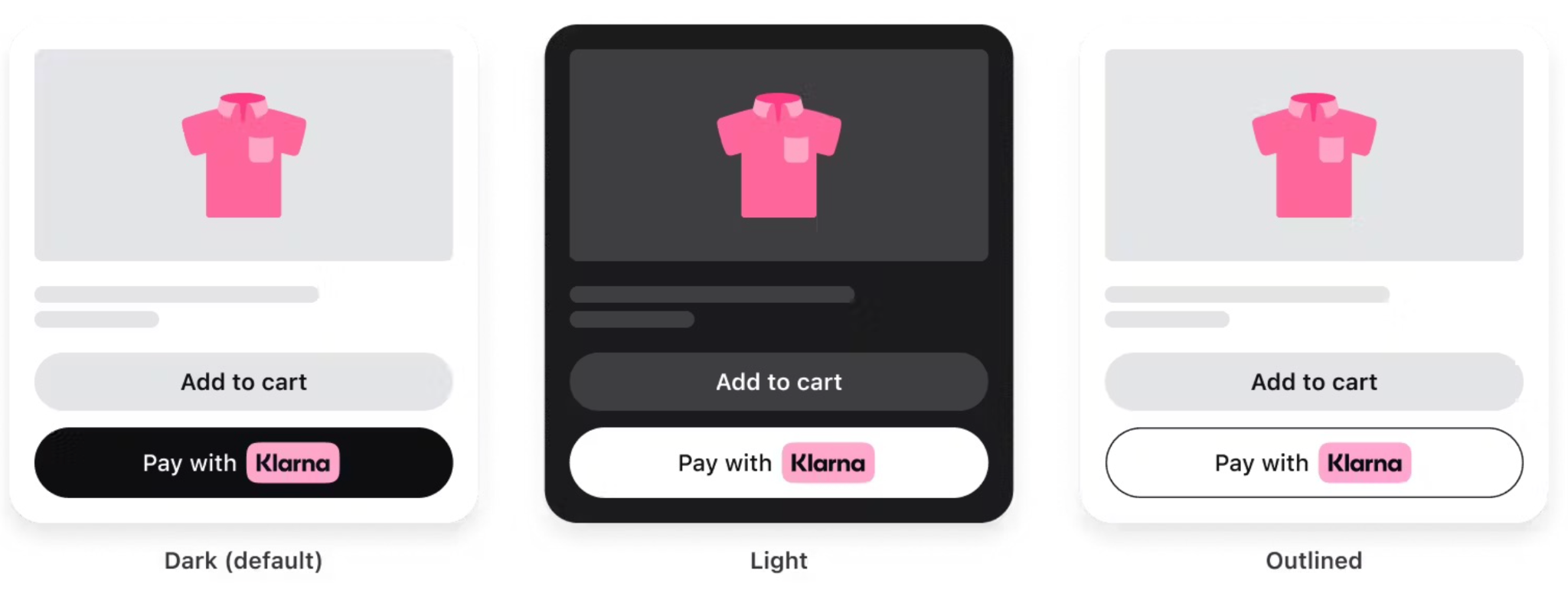
Consistency builds trust, especially during checkout. If your checkout button changes color, size, or wording at different steps, users may feel uncertain or lose their sense of progress.
A consistent design reassures users that they’re on the right path and that each step logically leads to the next. This is particularly important in multi-step checkout flows.
Consistency means:
When users feel oriented and in control, they’re more likely to complete the journey.
Checkout is where trust matters most. Even a well-designed button can fail if users feel unsure about security, payments, or order accuracy. Subtle trust signals near the checkout button can significantly improve confidence.
These elements should support the button, not overpower it. Their role is to quietly remove doubts, not distract attention.
Effective trust reinforcement includes:
When users feel safe, clicking the checkout button becomes a natural next step.
Once a user clicks the checkout button, the system should immediately acknowledge the action. Without feedback, users may click repeatedly or assume something went wrong, leading to frustration or errors.
Visual feedback reassures users that progress is happening and prevents accidental double submissions.
Good feedback practices include:
These small details create a smoother, more professional checkout experience.
There is no single perfect checkout button design. What works best depends on your audience, product type, and device usage. That’s why ongoing testing is essential.
Even small adjustments, such as color, wording, or placement, can produce measurable differences in conversion rates.
To optimize effectively:
Continuous refinement ensures your checkout button evolves with your customers’ expectations.
The checkout button may be just one element in your store’s design, but it carries the weight of your entire conversion funnel. When designed with clarity, confidence, and user psychology in mind, it becomes a silent salesperson guiding customers toward completion.
By focusing on visibility, clarity, consistency, and trust, you transform the checkout button from a functional necessity into a powerful conversion driver. In the end, great checkout design isn’t about pushing users, it’s about making the next step feel obvious, safe, and effortless.

