Please select the platform to login


Your homepage is one of the most powerful pages on your website, it sets the tone, guides user expectations, and plays a major role in determining whether visitors stay to explore or leave within seconds. A high bounce rate often means users aren’t finding enough clarity, relevance, or direction when they arrive. The right homepage layout can completely transform that experience by creating a structure that leads visitors deeper into your site naturally.
To help you optimize your design and dramatically reduce bounce rates, here are 8 homepage layout types, each explained in-depth, with insights into why they work and how they help create a more engaging user journey.
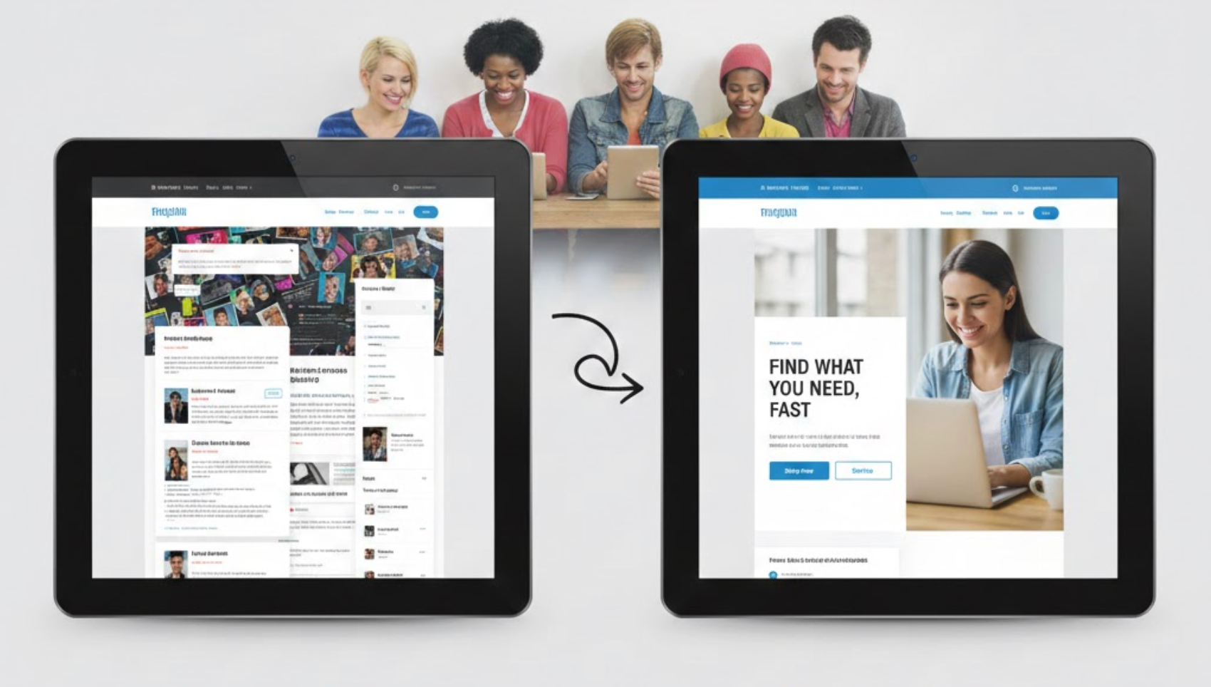
A clear value proposition layout emphasizes immediate clarity. At the top of the homepage, you present a concise headline that explains what you offer, followed by a helpful subheading that adds context or highlights your competitive advantage. This layout often includes a strong hero image or illustration that supports the message and a primary CTA that directs users to the next step, such as exploring products, booking a demo, or learning more.
The layout works especially well for service providers, SaaS companies, and brands with unique offerings. When users land on your homepage, they don’t have to scroll or guess; they instantly understand your identity, purpose, and value.
Why it reduces bounce rate:
Because visitors don’t have to spend time understanding what your site is about, they feel more confident and are more likely to continue interacting. Quick clarity keeps them engaged and prevents the frustration that leads to early exits.
This layout combines attention-grabbing visuals with a simple list of benefits to show users what they gain by staying on your site. The hero image makes an emotional impact, helping users connect with the brand’s tone and aesthetic. Right underneath, a benefits grid usually highlights 3–6 key advantages, such as free shipping, fast support, premium materials, or unique software features.
This structure is clean, organized, and great for both product-based and service-based businesses. It appeals to users visually while also giving them enough information to see the practical value behind your offer.
Why it reduces bounce rate:
People often decide within seconds whether a website meets their needs. The hero-plus-benefits combo quickly communicates why your website is worth their time, reducing hesitation and giving them reasons to keep scrolling.
For eCommerce brands, a product-first layout is one of the most effective options. It immediately showcases your best-selling items, new arrivals, or curated collections at the top of the homepage. Instead of forcing visitors to navigate menus, you place products directly in front of them, making the shopping process faster and more intuitive.
This layout can also include rating badges, labels such as “bestseller” or “limited stock,” and quick-add buttons for improved usability. It’s ideal for audiences who prefer browsing visually rather than reading long text.
Why it reduces bounce rate:
Visitors who land with the intention of buying won’t feel lost or overwhelmed. They can go straight to browsing products, which increases engagement, reduces friction, and keeps them on your website longer.
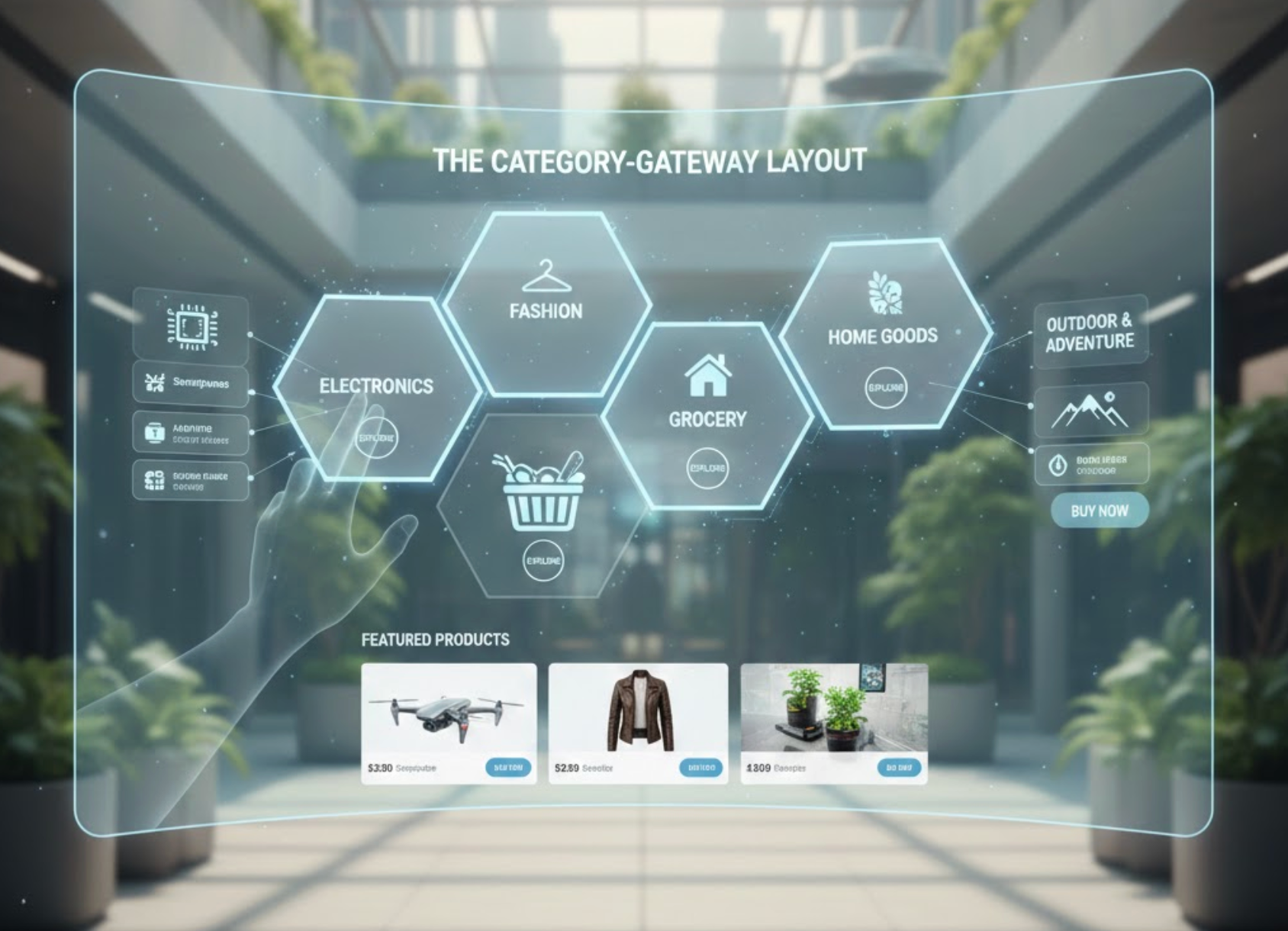
If you sell a large number of products across many categories, a category-gateway layout helps users navigate effortlessly. Instead of overwhelming visitors with too many items, the homepage displays clickable category cards or blocks such as “Men’s Clothing,” “Skincare,” “Tech Accessories,” or “Home Decor.”
Each block usually includes a clean image and a short label, making it easy for visitors to self-select where they want to go. This structure reduces cognitive load and creates a sense of order within your homepage design.
Why it reduces bounce rate:
When users quickly find the area relevant to them, they feel in control and more willing to explore. A clear path forward keeps them from dropping off due to confusion or decision fatigue.
A story-driven homepage is designed to build emotional connection. Instead of jumping straight into products or features, it takes visitors through a narrative flow, explaining who you are, why you started, what challenges you solve, and how your brand improves customers’ lives.
This layout often includes founder stories, mission statements, behind-the-scenes photos, or community-focused visuals. It humanizes your brand and helps users relate to your values, making it powerful for lifestyle brands, creative businesses, and purposeful organizations.
Why it reduces bounce rate:
Stories captivate. When users feel a deeper connection, they slow down, read more, and naturally explore additional pages. Emotional engagement is one of the strongest ways to reduce bounce rate.
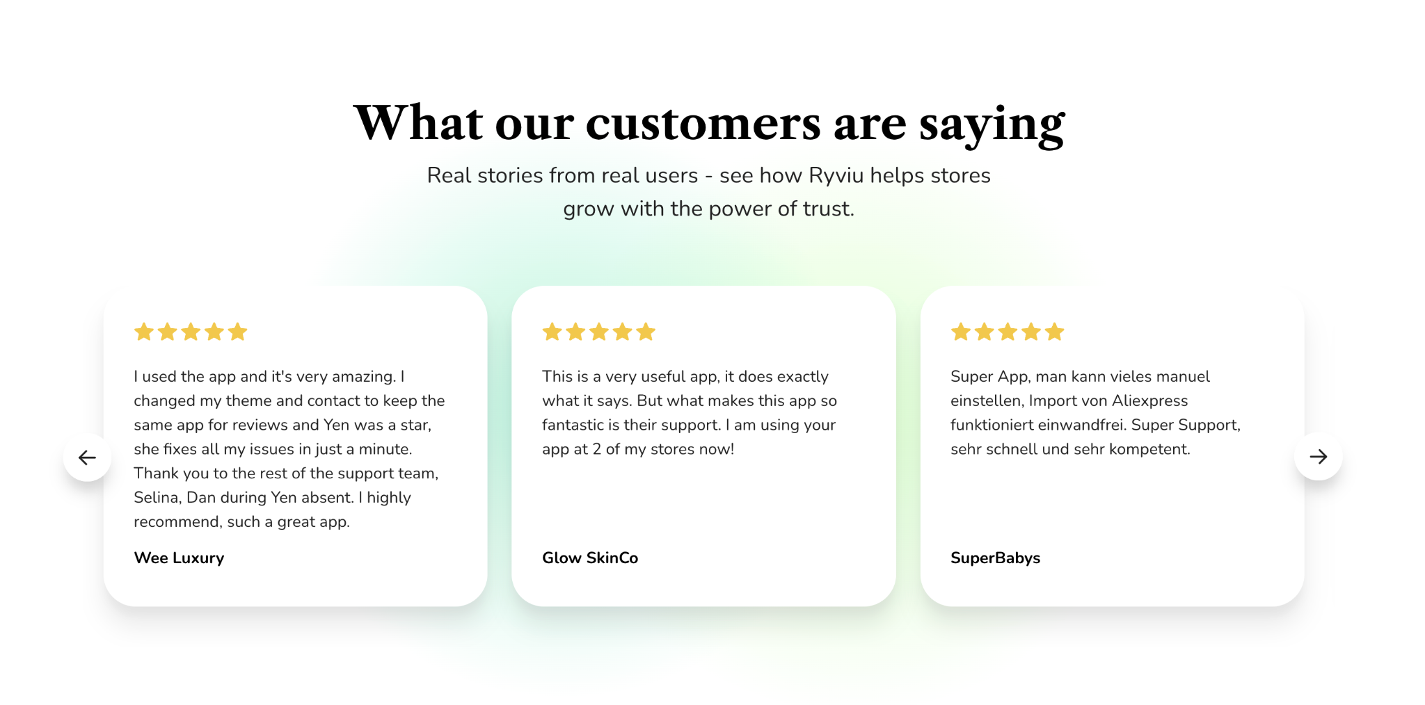
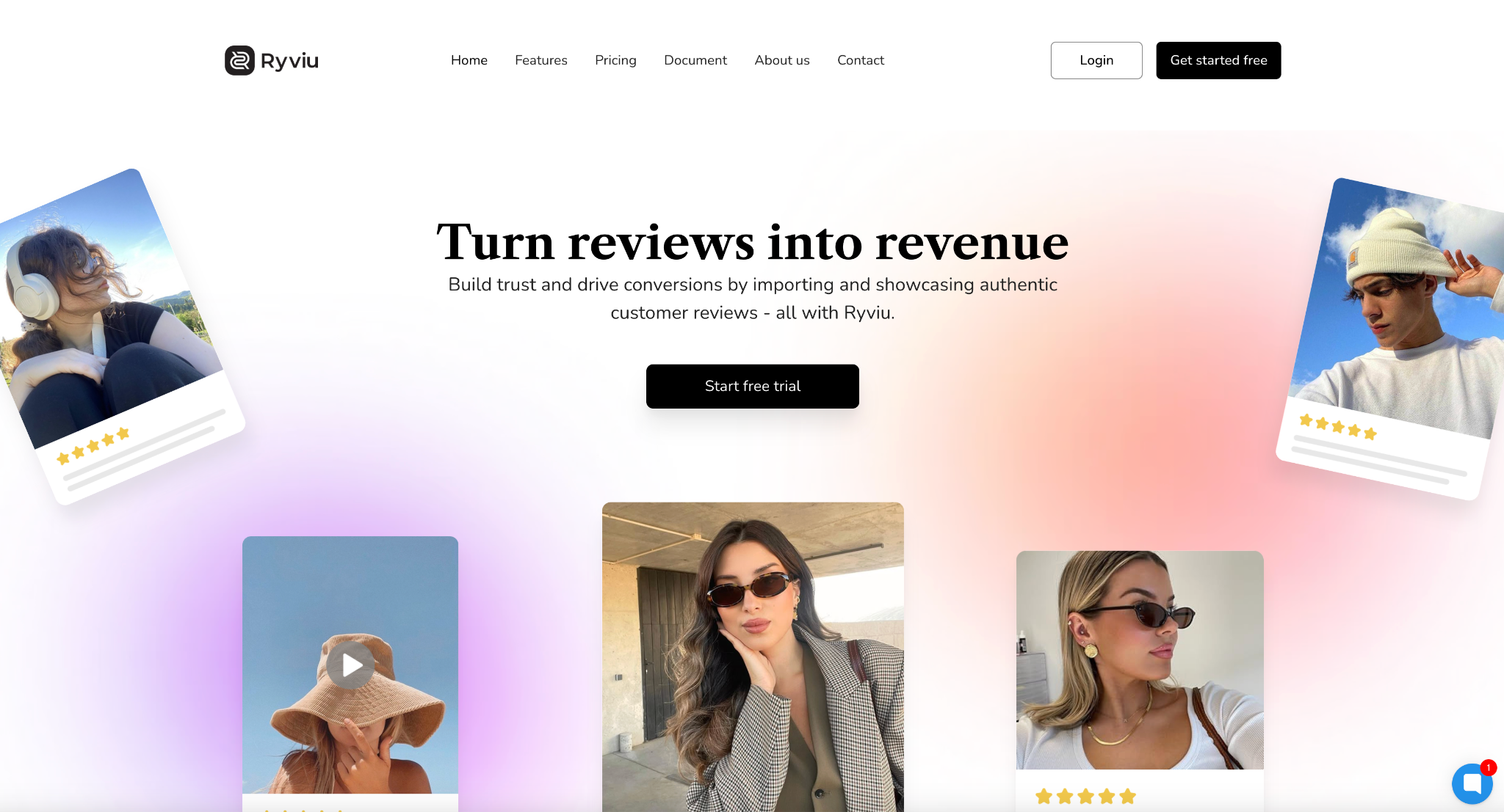
A trust-building homepage layout focuses on credibility. Instead of showcasing products or stories first, it highlights testimonials, customer reviews, star ratings, case studies, media logos, or UGC. These elements appear prominently, often above the fold or within the first scroll.
This layout works especially well for businesses aiming to build trust with new visitors who may not be familiar with the brand yet. It gives reassuring signals that others had a positive experience with your product or service.
Why it reduces bounce rate:
One of the most common reasons visitors leave is uncertainty. Seeing proof that others trust your brand instantly reduces skepticism and encourages users to continue browsing with confidence.
A minimalist layout strips away unnecessary elements and focuses on clean typography, simple visuals, clear CTAs, and balanced white space. Because it contains fewer heavy assets, it loads significantly faster, especially on mobile devices.
This layout works best for brands with a straightforward offering or those targeting a premium, sophisticated look. The simplicity helps users focus on the most important information without distractions.
Why it reduces bounce rate:
Speed is one of the most important factors affecting bounce rate. A minimalist layout loads quickly, feels easy to navigate, and provides a calming, intuitive user experience. Visitors don’t feel overwhelmed and are more likely to stay.
A content-hub layout is ideal for blogs, SaaS companies, educational platforms, and digital publications. Instead of focusing on products or company information, it highlights valuable content, such as articles, videos, tutorials, guides, and upcoming webinars.
Content is usually organized into sections like “Popular Now,” “New Resources,” and “Recommended for You,” making the homepage feel like a curated learning center. This layout encourages exploration and returning visits.
Why it reduces bounce rate:
When users see valuable content immediately, they’re naturally drawn to click and read more. It prevents them from bouncing because they instantly find what they came for, answers, knowledge, and helpful insights.
Not all layouts will fit every business, so the key to reducing bounce rate is choosing the one that aligns with your audience’s intent and expectations. Consider the following guidelines:
The right layout removes confusion, guides users smoothly, and encourages them to take action, whether that’s reading more, exploring categories, or making a purchase.
Reducing bounce rate isn’t simply about making your homepage more beautiful, yet it’s about creating a purposeful structure that guides users, delivers clarity, and supports their journey. Each of the eight homepage layouts above offers a unique approach to improving engagement, trust, and navigation.

