Please select the platform to login


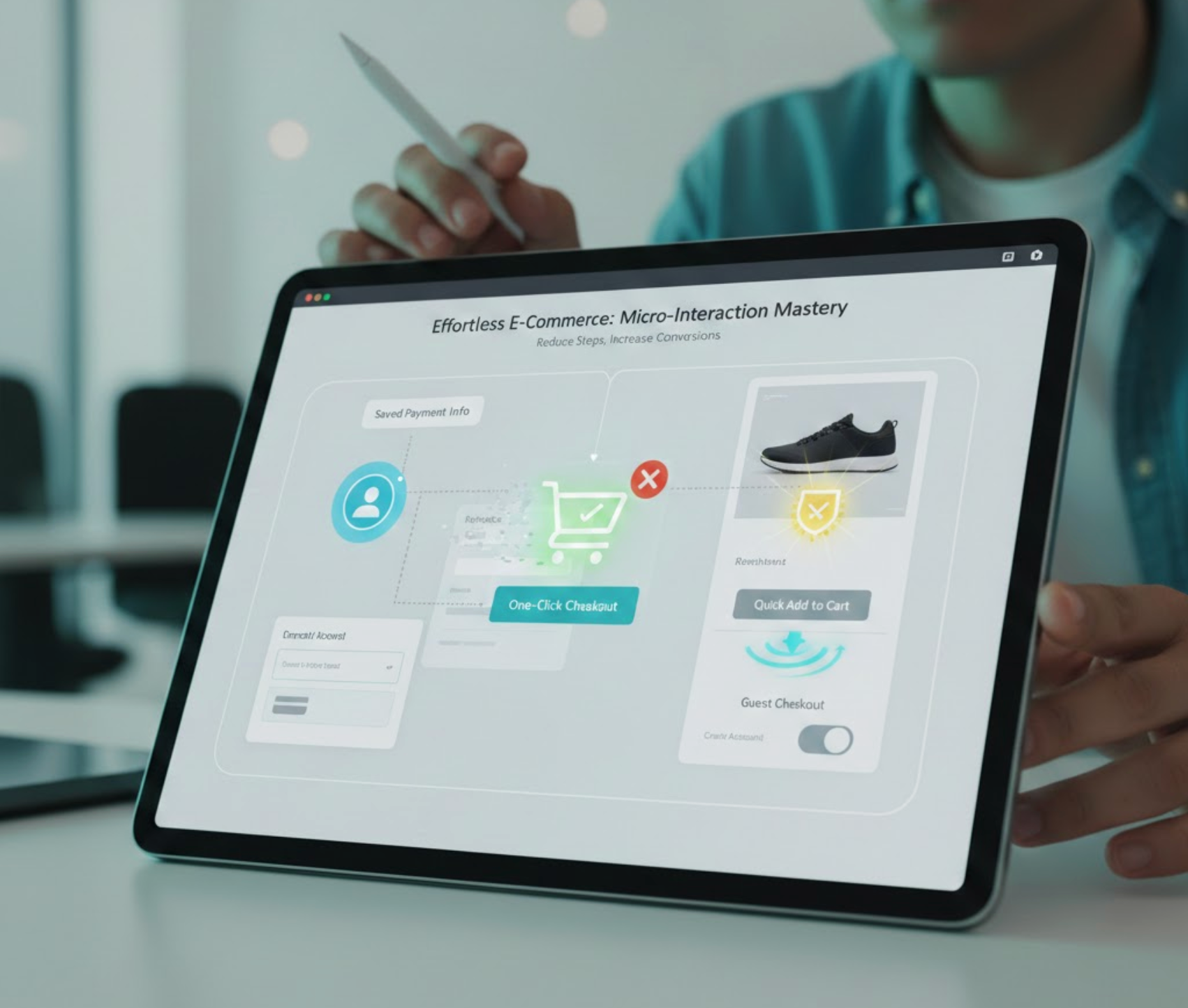
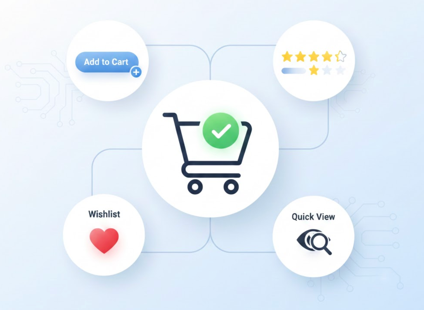
Microinteractions are the smallest units of user experience, but they carry an outsized influence on how users perceive your product or eCommerce store. Every tap, click, swipe, hover, or form submission is a moment where users subconsciously decide whether your interface feels smooth or frustrating. While major UX flaws are easy to spot, friction in microinteractions often goes unnoticed, yet it quietly interrupts momentum and increases abandonment.
Reducing friction at this level isn’t about adding more design polish or clever animations. It’s about removing hesitation, uncertainty, and unnecessary effort from the user’s journey so actions feel natural, fast, and reassuring.

One of the most common sources of friction in microinteractions is uncertainty. When users perform an action, they expect an immediate response that confirms what just happened. If that response is delayed, subtle, or unclear, users pause, second-guess themselves, or repeat actions, creating frustration and accidental errors.
Immediate feedback helps users feel in control. Visual changes, micro-animations, or short messages signal that the system is listening and responding. Without this confirmation, users often assume something went wrong, especially on slower connections or mobile devices.
Clear feedback reduces anxiety at each step, allowing users to move forward with confidence instead of hesitation.
Microinteractions often involve small decisions, choosing an option, interpreting a label, or understanding a button’s purpose. When these moments demand too much thinking, friction builds quickly, even if the task itself is simple.
Users don’t want to analyze every action. They rely on familiar patterns, predictable behavior, and clear language to move quickly through interfaces. When microinteractions introduce novelty or complexity without reason, users slow down and lose momentum.
By minimizing thinking at each micro step, you help users stay in flow and maintain forward progress.
Friction doesn’t only come from mental effort, it also comes from physical difficulty. If interacting with your interface requires precision, repeated adjustments, or careful tapping, users quickly become frustrated.
This issue is especially critical on mobile, where screen size, thumb reach, and movement limitations directly affect usability. Poorly designed tap targets can make even simple interactions feel clumsy and tiring.
When interactions feel physically easy, users perceive the entire interface as smoother and more professional.
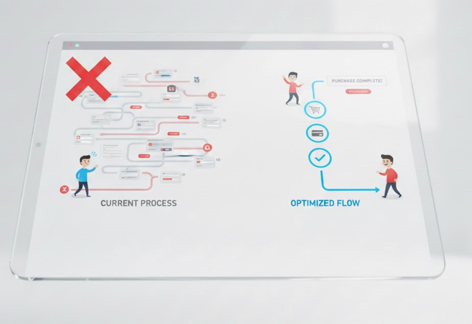
Every additional step inside a microinteraction, even a small one, adds resistance. While some steps are necessary, many are remnants of outdated UX practices or internal assumptions rather than user needs.
Interruptions such as unnecessary confirmations, extra clicks, or long animations break momentum. Over time, these small delays compound and make the experience feel heavier than it should be.
Streamlining interactions keeps users moving forward without unnecessary pauses or distractions.
Errors are a major source of friction, not just because they slow users down, but because they create emotional discomfort. The best microinteractions anticipate mistakes and prevent them before they happen.
Instead of reacting to errors after submission, proactive design gently guides users toward correct input. This approach reduces frustration and builds confidence in the interface.
Preventing errors at the micro level keeps interactions smooth and emotionally frictionless.
Inconsistency is a hidden source of friction. When similar actions behave differently across pages or devices, users must constantly re-learn how things work, which increases mental effort and hesitation.
Consistency turns microinteractions into habits. When users know what to expect, they act faster and with greater confidence.
A consistent interaction system reduces learning effort and makes every action feel intuitive.
Reducing friction in microinteractions is about paying attention to the moments users rarely articulate but deeply feel. These tiny interactions shape whether an experience feels smooth or frustrating, intuitive or exhausting. When feedback is clear, decisions are easy, actions are physically effortless, and errors are gently prevented, users move forward without resistance.
In eCommerce and product design, these small refinements compound over time. By smoothing microinteractions, you don’t just improve usability, you build trust, increase confidence, and create experiences that quietly guide users toward conversion without forcing them.

