Please select the platform to login


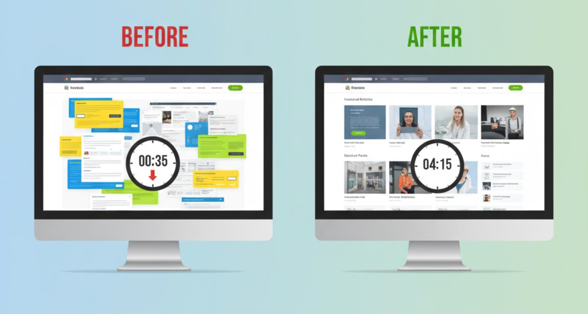
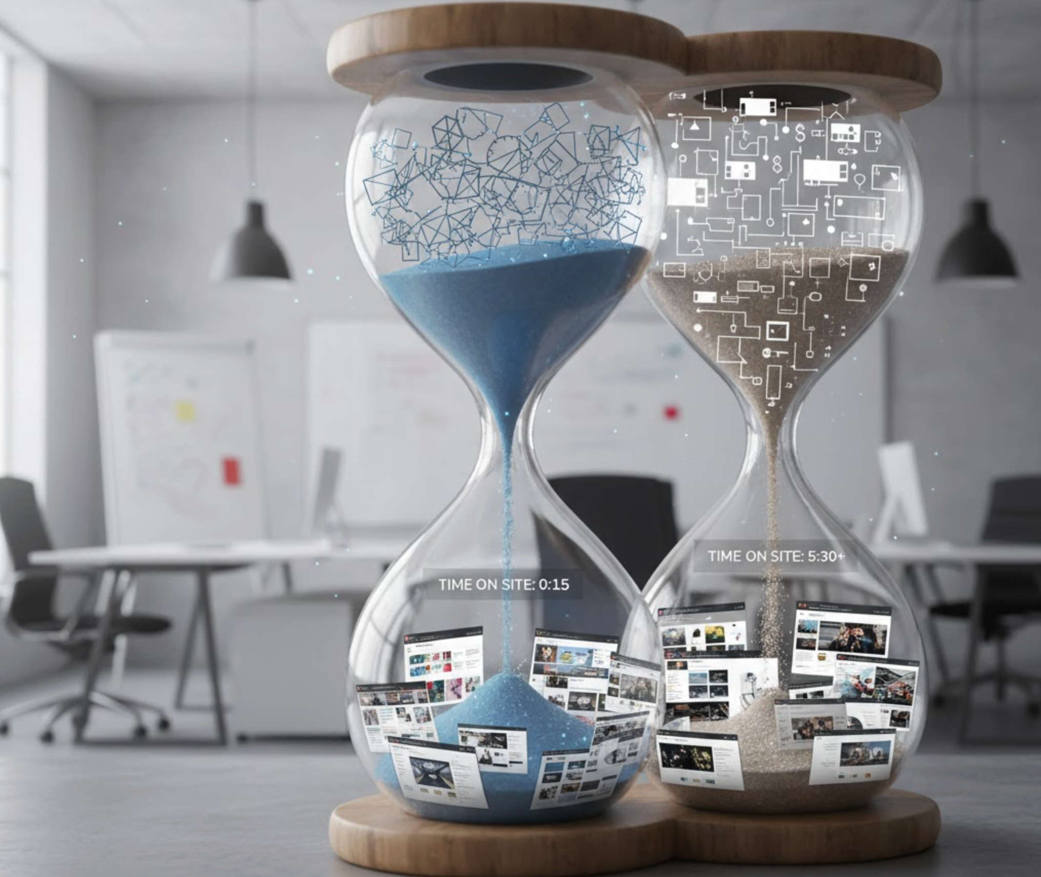
Time on site is one of the clearest indicators of user engagement, customer interest, and content relevance. When visitors remain on your website longer, they are more likely to explore additional pages, interact with more products, and eventually convert. This metric does not improve by chance, but it improves when your layout invites users to stay, reduces friction, and encourages seamless navigation.
A thoughtfully crafted layout can dramatically transform how people interact with your content. Instead of scanning quickly and bouncing, visitors become immersed in a visually balanced, easy-to-read experience that motivates them to keep scrolling. In this guide, we explore why layout matters and how smart design strategies can significantly boost time on site.
The layout of your website dictates how users interpret information, where their eyes go first, and how easily they can move from one section to another. Even great content falls short if the page structure feels cluttered, overwhelming, or disorganized. When your layout feels intuitive and visually clean, users feel more comfortable and naturally stay longer.
A strong layout enhances browsing by guiding attention, reducing decision fatigue, and creating a sense of flow from one section to the next. It also helps visitors focus on the message rather than figuring out where to look. Over time, these small improvements lead to significant increases in session duration and lower bounce rates.
Improving time on site starts with understanding a few foundational design principles. These help you create layouts that feel natural to the user and guide them smoothly through the content.
A clear hierarchy ensures users can instantly distinguish between headings, body content, images, and CTAs. When key information stands out, visitors feel oriented and willing to explore deeper into the page. Bold titles, contrasting fonts, and structured sections make scanning easier and reduce cognitive load.
White space creates an inviting environment by giving each element room to breathe. Instead of overwhelming users with compressed content, intentional spacing makes your design feel modern, clean, and relaxing. This balance motivates visitors to keep scrolling and spend more time reading.
Humans read in predictable patterns, which is why layouts using F-shaped or Z-shaped flows work so effectively. These patterns align with natural eye movements, helping users process information effortlessly. When content feels intuitive, users stay longer and consume more.
Navigation consistency ensures visitors always know where they are and how to move forward. A clear header, organized menu, and smooth internal links prevent frustration. When users never feel lost, they naturally choose to stay and continue exploring.
Directional cues like icons, arrows, overlapping layers, and subtle animations help guide attention through the page. These cues encourage deeper exploration without feeling pushy. Even simple hover effects can create engaging moments that hold users longer.
Once the core principles are in place, applying practical layout tactics can significantly extend user session duration. These strategies make the browsing experience more enjoyable and encourage people to spend more time interacting with your content.
Breaking content into visually distinct sections makes the page easier to scan and more pleasant to read. Background color shifts, bold section titles, or modular blocks help users digest information at a comfortable pace. This structure keeps visitors scrolling from one section to the next with minimal friction.
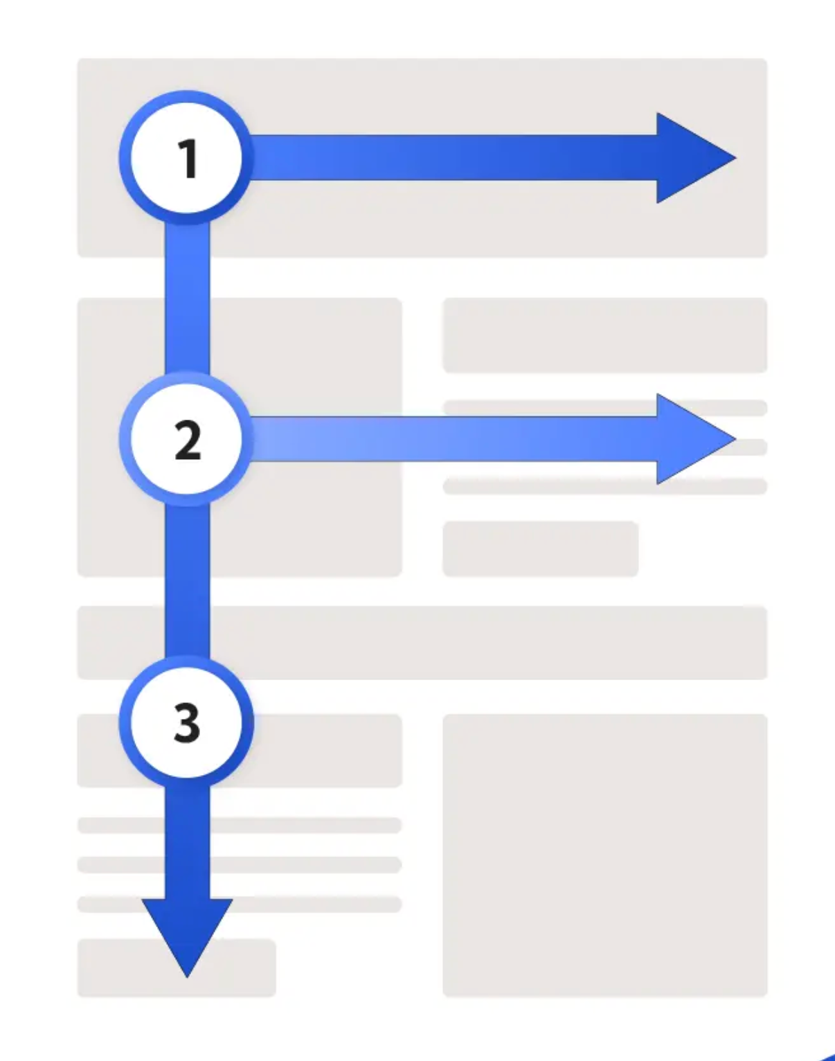
Z-shaped or F-shaped patterns match natural user behavior. You can place the most important content, like headlines, CTAs, product details, or value propositions, where the eye naturally lands. This approach ensures users follow your intended path, increasing time spent on each page.
Sticky navigation bars, sticky “Add to Cart” buttons, or floating filter panels help users take action without losing their place. These tools remove unnecessary scrolling and make the browsing experience smoother. As users feel more at ease navigating, they are more likely to stay longer.
Visual anchors like large images, card grids, or bold subheadings break complex information into digestible pieces. These anchors act like stopping points where users pause, read, and re-engage before moving on. This rhythm makes long pages feel more manageable and increases dwell time.
Readable typography is essential for retaining visitors. Proper line height, text size, contrast, and spacing make long reading sessions possible. When users can comfortably read for longer periods, your time-on-site metrics naturally increase.
Well-placed images help illustrate concepts, guide emotions, and maintain engagement. However, overusing visuals can create clutter and slow down the page. A purposeful balance ensures users stay connected to the content instead of feeling visually overwhelmed.
Adding “related articles,” product recommendations, or next-step CTAs at the end of each section can guide users into exploring more pages. These loops create a sense of curiosity and continuity. As visitors click through naturally connected content, their session duration increases.
Your first step is understanding how your current layout performs and where users drop off. By analyzing your pages, you can identify patterns that may be causing frustration or early exits.
To prepare for layout improvements, take a closer look at your biggest performance gaps.
Before focusing on colors or visuals, concentrate on reorganizing your content structure so users can follow a logical journey. Structural clarity determines how easily visitors interpret your message and move through the page.
Once your structure feels intuitive, you can refine the visual presentation.
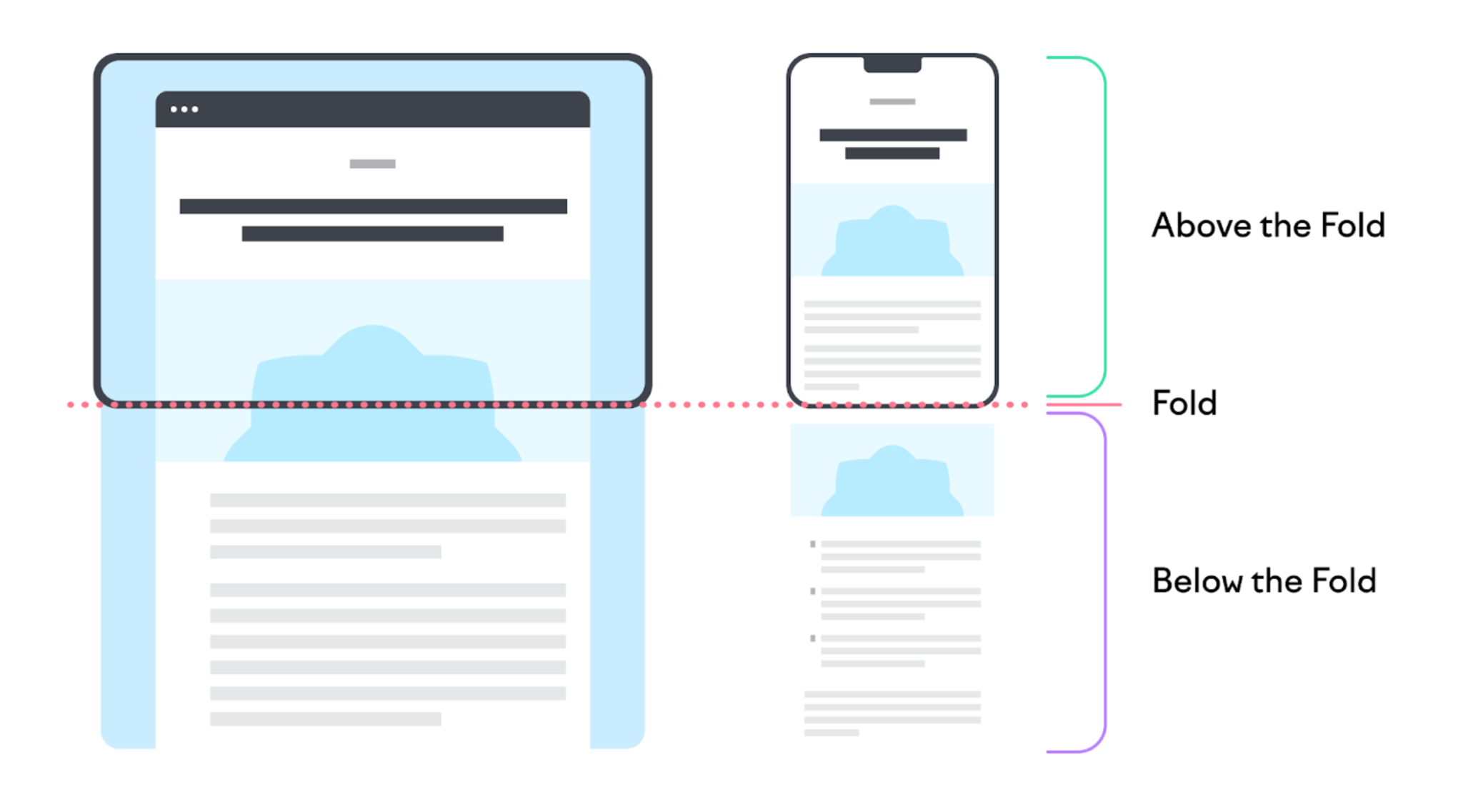
The first screen visitors see determines whether they continue exploring or leave. Strong above-the-fold content communicates value quickly and inspires confidence.
After this section is optimized, the rest of the page can support and expand on your message.
Scroll-friendly sections help users consume content gradually without feeling overwhelmed. Each section should provide enough information to be valuable but short enough to avoid fatigue.
Once you establish this rhythm, visitors feel more encouraged to keep scrolling.
Navigation must feel seamless for users to continue exploring your site. When visitors can find what they need without friction, they naturally spend more time reading or browsing.
After navigation is simplified, engagement levels tend to rise steadily.
Continuous testing helps you understand what layout style resonates best with your audience. Small changes such as CTA placement or hero size can dramatically increase time on site.
Once you gather insights, refine your layout to match real user behavior.
Improving time on site is ultimately about crafting a layout that feels effortless, intuitive, and enjoyable for users. When the structure is clear, navigation is smooth, and content flows naturally, visitors stay longer and engage more deeply. By applying these layout principles and following a systematic improvement process, you can dramatically enhance user experience and drive higher conversions.

